

Guide to color and website accessibility sets the stage for a deep dive into the crucial role of color in web design, ensuring websites are usable and appealing to everyone. This guide will explore color theory, accessibility guidelines, and practical techniques for selecting and using colors that meet WCAG standards. From fundamental principles to advanced strategies, we’ll cover everything you need to create websites that are both visually engaging and inclusive.
We’ll delve into the importance of color contrast, providing examples and tools to ensure your website is accessible to users with visual impairments. You’ll learn how to create visually appealing color palettes that meet accessibility standards and adapt them for various screen sizes and devices. We’ll also discuss the impact of color psychology on user experience and how to choose colors that resonate with different audiences.
Introduction to Color and Accessibility
Color is a powerful design element that can significantly impact user experience on a website. It influences mood, evokes feelings, and guides users through the content. A well-chosen color palette can make a site visually appealing and engaging, while poor choices can create a confusing and frustrating experience. Effective color use is crucial for a successful website, and this section will delve into the fundamental principles of color and its critical role in accessibility.Color theory provides the framework for understanding how colors interact and affect each other.
Understanding these principles is essential for designing visually appealing and usable websites. Color contrast, specifically, is paramount for accessibility, ensuring that users with visual impairments can perceive the content clearly.
Color and Web Design Principles
Color is a fundamental component of visual communication. It can convey meaning, influence emotions, and create a unique brand identity. In web design, selecting appropriate colors is essential for establishing a consistent visual theme and creating a positive user experience. Choosing colors that complement each other creates a cohesive and visually appealing website, whereas clashing colors can be jarring and distracting.
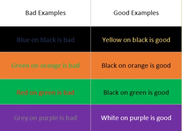
Color Contrast for Accessibility
Color contrast is critical for website accessibility, especially for users with visual impairments, such as low vision or color blindness. Adequate color contrast ensures that text and other essential elements are easily discernible against their backgrounds. This principle is crucial for ensuring inclusivity and usability for all users. Failure to adhere to these guidelines can significantly hinder the user experience for those with visual impairments.
Importance of Color in Visual Appeal and Usability
Effective use of color enhances visual appeal and contributes to a user-friendly website. Using a harmonious color scheme that aligns with the website’s theme and target audience is key. This not only improves the aesthetic experience but also helps maintain user focus and guide them through the site. Color plays a vital role in reinforcing the overall design and user interface, creating a coherent and intuitive experience.
Common Color Combinations and Contrast Ratios
Understanding the contrast between colors is essential for accessibility. A well-designed website ensures that all text and other important elements have sufficient contrast to be easily readable. The following table illustrates common color combinations and their corresponding contrast ratios. These ratios are crucial for ensuring compliance with accessibility guidelines and usability for users with various visual needs.
| Color Combination | Contrast Ratio | Accessibility Impact |
|---|---|---|
| Black text on white background | 21:1 | Excellent contrast, suitable for all users |
| Dark gray text on light gray background | 4.5:1 | Adequate contrast, suitable for body text |
| Red text on yellow background | 2.1:1 | Low contrast, may be insufficient for body text, use with caution |
| Dark blue text on light blue background | 3:1 | Good contrast, suitable for headings |
Understanding Color Contrast and Accessibility Guidelines
Color contrast is crucial for website accessibility, ensuring that people with visual impairments can perceive and interact with content effectively. This involves understanding how different colors interact and how their differences in luminance create readability and usability. This section delves into the Web Content Accessibility Guidelines (WCAG) and how they dictate color contrast requirements for web accessibility.WCAG, or Web Content Accessibility Guidelines, are a set of guidelines developed by the World Wide Web Consortium (W3C).
A guide to color and website accessibility is crucial for inclusivity, but understanding your brand’s positioning is equally important. Think about how your website’s colors and design choices relate to your overall brand identity, like a visual representation of your company’s values. Knowing what is brand positioning and why does it matter, like this , can significantly impact how users perceive your brand.
Ultimately, a well-designed and accessible website, built on a solid brand foundation, is key to creating a positive user experience.
They provide a framework for creating accessible websites, encompassing various aspects of user experience. Following these guidelines is essential to make websites usable by people with disabilities.
WCAG and Color Contrast Requirements
WCAG specifies minimum color contrast ratios to ensure sufficient visibility. These ratios measure the difference in luminance between foreground (text or other elements) and background colors. Meeting these standards is vital for ensuring that users with visual impairments can distinguish text and other important elements against the background. This is especially important for users relying on screen readers or other assistive technologies.
Specific WCAG Color Contrast Ratios
WCAG 2.1 and WC.AG 2.2 have different requirements for color contrast depending on the level of contrast needed. The guidelines define different success criteria based on the size of text and the luminance of the foreground and background colors.
- For normal-sized text, a minimum contrast ratio of 4.5:1 is required for normal text and 3:1 for large text (14pt and 18pt bold, or larger). Large text is often used in headings or other important elements.
- Furthermore, there are additional contrast requirements for graphical elements, including images of text. These often involve evaluating the luminance differences in the image itself.
- For graphical objects, the WCAG contrast guidelines are more nuanced and often require evaluating the contrast of different portions of the graphic.
Examples of Sufficient Color Contrast Ratios
The contrast ratio is calculated based on the luminance values of the foreground and background colors. Different colors have varying luminance levels, which are factored into the ratio calculation. Examples include:
- A black text on a white background has a high contrast ratio, making it very readable.
- Dark gray text on a light gray background can have a sufficient contrast ratio, but its readability may vary based on individual needs and luminance differences.
- Conversely, light gray text on a dark gray background may not have sufficient contrast and could be difficult to read for some users.
Evaluating Color Contrast Using Online Tools
Several online tools can help evaluate color contrast ratios. These tools take the foreground and background colors as input and calculate the contrast ratio, helping to ensure adherence to accessibility guidelines.
- WebAIM’s color contrast checker is a popular and free online tool.
- Other tools exist, offering similar functionality for evaluating color contrast and ensuring compliance with WCAG guidelines.
Color Palette Examples and Contrast Ratios
The following table demonstrates color palettes and their contrast ratios against different background colors.
| Foreground Color | Background Color | Contrast Ratio |
|---|---|---|
| #000000 (Black) | #FFFFFF (White) | 21:1 |
| #000000 (Black) | #F0F8FF (Light Blue) | 10.5:1 |
| #808080 (Gray) | #D3D3D3 (Light Gray) | 3.5:1 |
| #FF0000 (Red) | #FFFF00 (Yellow) | 2.8:1 |
Color Palette Selection for Accessibility
Choosing a color palette for your website is more than just aesthetics; it’s a crucial aspect of accessibility. A well-chosen palette considers the needs of all users, including those with visual impairments. This section delves into the principles of selecting accessible color palettes, focusing on contrast, psychology, and user needs.Effective color palettes are essential for websites to be usable by everyone.
A good palette will allow users to easily distinguish elements, such as text from backgrounds, buttons, and links, leading to a more intuitive and enjoyable user experience.
A guide to color and website accessibility is crucial for inclusivity, ensuring everyone can navigate online content. The recent changes in the US Google Ad business, like the us google ad business breakup , highlight the need for clear and accessible digital spaces. Ultimately, these considerations, from color palettes to website structure, impact the user experience, particularly in the wake of such market shifts.
Color Contrast Ratios and Accessibility Guidelines
Understanding color contrast ratios is fundamental to accessibility. Guidelines, such as those from the Web Content Accessibility Guidelines (WCAG), specify minimum contrast ratios between foreground (text) and background colors. These ratios ensure sufficient visibility for users with various visual impairments, including those who rely on assistive technologies like screen readers. Meeting these standards prevents difficulties for users with low vision or color blindness.
The goal is clear and consistent visual separation of text and background, making the content easily discernible.
Techniques for Creating Visually Appealing and Accessible Color Palettes
Creating accessible color palettes doesn’t mean sacrificing visual appeal. Several techniques can help you design attractive palettes that comply with accessibility guidelines. Tools such as online contrast checkers are invaluable for ensuring sufficient contrast between colors. These tools allow you to input color choices and instantly receive their contrast ratios, assisting in the process of selecting colors that meet accessibility requirements.
Furthermore, using color palettes based on existing, well-vetted accessibility guidelines helps maintain consistency and reduces errors.
Role of Color Psychology in Website Design and Accessibility
Color psychology plays a significant role in website design. Different colors evoke different emotions and associations. Understanding these psychological effects can help you choose colors that align with your brand and message while also maintaining accessibility. For example, warm colors like reds and oranges can be stimulating, while cool colors like blues and greens can be calming. These associations can impact the user experience.
Choosing colors that are appropriate for the website’s intended purpose is critical.
Color Combinations for Different User Needs
Different color combinations are effective for different user needs. For example, high-contrast combinations, like black text on a white background, are ideal for users with low vision or color blindness. For websites targeting users with specific needs, considering color combinations that cater to those needs is essential. For instance, websites focused on health or wellness might use calming colors, while those focused on technology might use more vibrant colors.
Considering user groups and their potential needs is a crucial aspect of creating an accessible website.
Strategies for Creating Visually Appealing Palettes While Maintaining Adequate Color Contrast
Visual appeal and accessibility can be achieved concurrently. Employing tools to measure color contrast is key. Using color palettes based on accessibility guidelines provides a solid foundation. A balanced approach considers both aesthetic appeal and the necessity of sufficient contrast. By integrating these strategies, you can craft visually appealing websites that are accessible to all users.
Color Palette Examples and Their Impact
| Color Palette | Contrast Ratio | Potential Impact on User Groups |
|---|---|---|
| Black text on white background | >4.5:1 | High contrast, suitable for users with low vision or color blindness; generally good for all users. |
| Dark gray text on light gray background | >3:1 | Moderate contrast, suitable for headings and secondary text; may be less ideal for users with severe vision impairments. |
| Dark teal text on a light peach background | >4.5:1 | Good contrast, generally suitable for most users. The combination of teal and peach offers a unique and appealing aesthetic. |
Color Use in Different Website Components
Color is more than just aesthetics on a website; it’s a crucial element for user experience and accessibility. Proper color usage enhances usability, making your site navigable and understandable for everyone, including users with visual impairments. This section delves into best practices for employing color effectively across various website components, ensuring a positive and inclusive experience for all visitors.
Color in Headings
Headings are vital for structuring content and guiding users through your website. Using contrasting colors between headings and the surrounding text ensures readability and clarity. Headings should be distinct enough to stand out without being overwhelming. A high contrast ratio between the heading text and the background is crucial for accessibility.
Color in Links
Links are essential for navigation, and color plays a significant role in making them easily identifiable. A contrasting color between the link text and the background is important for users to quickly scan and understand the clickable elements. Using underlined text in addition to color distinction can further improve the user experience, particularly for users with visual impairments.
Color in Interactive Elements
Buttons, toggles, and other interactive elements require distinct visual cues. Color contrast is vital here, as users need to quickly understand what elements are interactive and how to interact with them. Using different shades of a color, or patterns in conjunction with color, can also effectively differentiate interactive elements.
Color in Forms and Input Fields
Forms are crucial for user interaction. Color is essential for highlighting form elements, such as labels and input fields, and providing clear feedback. Use a contrasting color for form labels to guide users through the input process. Errors should be clearly indicated with a distinct, high-contrast color.
Visual Hierarchy, Guide to color and website accessibility
Creating a clear visual hierarchy is important for guiding the user’s eye. Using different colors for different levels of headings, links, and other elements creates a visual structure that aids in comprehension and navigation. Color contrast is key to this, as it allows users to easily distinguish between elements of different importance.
A guide to color and website accessibility is crucial for inclusivity, but understanding your target audience is key. This involves more than just the visual elements; you need to consider keyword research for multiple domains in the same niche keyword research for multiple domains in the same niche to tailor your content for maximum reach and engagement.
Ultimately, a well-designed accessible website benefits everyone, from diverse users to search engine optimization.
Color Consistency
Consistency in color usage across your website is crucial. Employing the same color scheme for similar elements throughout the site creates a recognizable and user-friendly experience. Users should be able to navigate your site easily, knowing the meaning of different colors based on their placement.
Table: Color Choices and Accessibility Impact
| Website Element | Recommended Color Choices | Accessibility Impact |
|---|---|---|
| Headings (H1-H6) | Dark text on light background or vice versa, with high contrast ratio | Improved readability and understanding of content structure |
| Links | Dark blue or purple on a light background, or a distinct color that contrasts well with the background | Easy identification of clickable elements |
| Buttons | High contrast color for button text and background | Clear indication of interactive elements |
| Form Labels | High contrast with input fields | Improved clarity for input fields |
| Error Messages | Red or a similar high-contrast color | Clear indication of errors |
Tools and Techniques for Color Accessibility Testing
Ensuring your website’s colors are accessible to everyone is crucial for inclusivity. This section dives into the practical methods for testing color contrast and identifying potential accessibility issues. From free online tools to manual checks and automated accessibility checkers, we’ll explore the spectrum of techniques available to make your website a welcoming experience for all users.Testing color accessibility isn’t a one-size-fits-all process.
Different tools and methods offer varying levels of detail and support. Understanding the strengths and limitations of each approach will allow you to effectively identify and address color-related accessibility issues.
Free Online Color Contrast Tools
These tools are invaluable for quickly evaluating color combinations. They automate the contrast calculations, saving you significant time and effort.
- WebAIM’s Color Contrast Checker: A widely used and trusted tool for calculating color contrast ratios. It allows you to input foreground and background color values, and it will output the contrast ratio, helping you determine whether the combination meets WCAG guidelines.
- Paciello Group’s Contrast Checker: Another reliable option for calculating color contrast ratios. It provides a clear and concise result, allowing you to assess the accessibility of your color choices rapidly.
- Colorzilla’s Color Contrast Tool: This tool offers a user-friendly interface for checking color contrast. It is particularly useful for quickly comparing various color combinations and ensuring they meet accessibility standards.
Manual Color Contrast Testing
While tools automate the calculation, understanding manual methods helps in deeper analysis and problem-solving.
- Using a color blindness simulator: Simulators allow you to visualize how your color choices appear to users with different types of color vision deficiencies. This crucial step helps identify potentially problematic combinations for colorblind users.
- Visual inspection: Don’t underestimate the value of careful visual inspection. Look closely at your color choices on various devices and under different lighting conditions. A simple visual assessment can reveal subtle problems that automated tools might miss.
Using Accessibility Checkers
Automated accessibility checkers can identify color-related issues within your website’s code.
- Integrating accessibility checkers into your development workflow: Many accessibility checkers can be integrated into your development environment, allowing for early identification of color contrast issues and faster resolution. Tools like WAVE and Axe provide alerts when color combinations do not meet accessibility guidelines.
- Understanding the limitations of automated checkers: Automated tools are useful, but they are not perfect. Some subtle or complex issues might not be caught. They should be used as part of a larger testing strategy that includes manual checks and user testing.
User Testing for Color Accessibility
User testing provides invaluable insights into how real users perceive and interact with your website’s color choices.
- Recruiting diverse participants: For comprehensive testing, ensure your participants represent a variety of users, including those with color vision deficiencies. This will help you identify and address potential problems for this demographic.
- Observing user behavior: Pay close attention to how users interact with elements of your website, particularly those relying on color cues. This will help reveal any usability issues stemming from the color choices.
Accessible Color Palette Generators and Contrast Checkers
These resources help you select and test accessible color palettes.
- Color palettes that are pre-vetted for accessibility: These palettes are pre-tested to meet accessibility standards, saving you time and effort. This significantly reduces the chances of overlooking critical accessibility considerations.
- Contrast checker integration: Look for color palette generators that include integrated contrast checkers. This allows for immediate feedback on the accessibility of your chosen colors.
Case Studies and Examples
Color accessibility isn’t just about following guidelines; it’s about creating a website that’s usable and inclusive for everyone. Examining successful and unsuccessful implementations provides valuable lessons for building websites that meet accessibility needs. This section explores real-world examples to illustrate best practices and common pitfalls.Effective color use enhances a website’s usability and accessibility. Analyzing successful and unsuccessful implementations helps identify best practices and common mistakes.
By examining examples, we can better understand how to create inclusive websites that cater to diverse needs.
Examples of Effective Color Use
Color palettes are not just aesthetic choices; they significantly impact user experience and accessibility. Websites that successfully incorporate color accessibility principles create intuitive interfaces and provide clear information hierarchies. The following examples demonstrate the impact of well-chosen color palettes.

- The World Wide Web Consortium (W3C): The W3C website consistently uses a color palette that adheres to accessibility guidelines. The contrasting colors between text and background elements, coupled with sufficient contrast ratios, make the content easily readable for users with visual impairments. This ensures that users with visual impairments can easily navigate and comprehend the information presented on the site.
- Microsoft’s Accessibility Resources: Microsoft’s website dedicated to accessibility features an easily navigable interface with high contrast between elements. The color choices facilitate easy readability, demonstrating the importance of color contrast for users with various visual needs. By following these examples, website developers can design more accessible and user-friendly platforms.
- Common accessibility features like color contrast: Many websites successfully implement color contrast guidelines, providing a positive experience for all users. A well-designed color palette allows for effective communication of information and intuitive navigation. These features support accessibility, ensuring the website is usable for individuals with visual impairments.
Examples of Poor Color Choices
Unfortunately, not all websites prioritize color accessibility. Poor color choices can create significant usability problems, especially for users with visual impairments. The following examples highlight common mistakes and their consequences.
- Low contrast ratios: Websites that use colors with insufficient contrast ratios can make text unreadable for users with low vision or color blindness. This lack of clarity and visibility can severely impact usability and hinder users’ ability to understand and interact with the site effectively.
- Inconsistent color usage: Inconsistent color schemes can lead to confusion and make navigation challenging. The lack of a coherent color system makes it harder to understand the relationship between different elements on the site. This disorganization can be frustrating for users trying to find specific information.
- Overuse of saturated colors: Websites that use overly saturated colors can strain the eyes, making the experience less enjoyable. The intensity of colors can create a visually overwhelming experience, negatively affecting the user experience, especially for users with sensitive eyes or visual impairments.
Color Usage in Different Website Layouts
Color is a powerful tool for creating engaging and intuitive layouts. Using color strategically can enhance user experience and accessibility. The following examples illustrate how color can be used effectively.
- Visual Hierarchy: Using different shades of a color to highlight important elements and create a clear visual hierarchy can improve the readability of a website. This allows users to quickly understand the structure of the site and locate critical information effectively.
- Interactive elements: Using colors to differentiate interactive elements (buttons, links) from static elements improves usability. This visual distinction allows users to easily identify interactive areas, enhancing their overall interaction with the website.
- Emphasis and calls to action: Colors can be used to emphasize important information and guide users toward specific actions. This creates a visually appealing and effective call to action, encouraging users to engage with the website’s content.
Color Choices for Different Audiences
Considering the diverse needs of users is crucial for effective color usage. Different audiences require different approaches to color. The following examples illustrate how color choices can be tailored to specific audiences.
- Color blindness: Websites need to consider the needs of users with color blindness. Using color contrast and other techniques can ensure that information is still accessible to these users.
- Age and visual impairments: Websites should prioritize clear and easily readable text, especially for older users or those with visual impairments. High contrast and well-spaced text are key considerations for improved readability and usability.
- Cultural considerations: Colors can carry different meanings in various cultures. A website should be mindful of cultural sensitivities and avoid using colors that could be offensive or inappropriate to certain groups.
Impact of Accessible Color Palettes
Accessible color palettes have a positive impact on user experience. A well-designed color palette enhances readability, reduces visual strain, and improves the overall usability of a website.
- Increased usability: A website with a clear and accessible color scheme improves the ease of use for all users, including those with visual impairments.
- Enhanced user engagement: A visually appealing website, created with accessibility in mind, can improve user engagement and foster a more positive experience.
- Broader audience reach: Accessible color palettes make websites more inclusive, allowing a wider range of users to access and utilize the website’s content.
Comparison of Website Color Palettes and Accessibility
| Website | Color Palette | Accessibility Features | Evaluation |
|---|---|---|---|
| Example Website 1 | Muted tones, high contrast | Excellent contrast ratios, clear visual hierarchy | Excellent |
| Example Website 2 | Bright, saturated colors | Low contrast ratios, inconsistent color usage | Poor |
| Example Website 3 | Neutral tones, good contrast | Adequate contrast, clear typography | Good |
Responsive Design Considerations for Color
Ensuring consistent and accessible color experiences across diverse screen sizes and devices is crucial for a positive user experience. A website that functions flawlessly on a desktop monitor should maintain its accessibility on a smartphone or tablet. This responsiveness extends to color, requiring careful consideration of how color palettes and contrast ratios adapt to varying screen resolutions and user needs.Responsive design for color accessibility necessitates a proactive approach to adaptation, moving beyond simply scaling down existing desktop designs.
It involves understanding how different devices render colors and how contrast ratios change with screen size. This necessitates thoughtful consideration of color palettes that can gracefully adjust to various resolutions without compromising accessibility.
Color Adaptation in Responsive Design
Color adaptation in responsive design ensures that the website maintains its legibility and usability across different screen sizes. This involves designing color palettes that can be rendered correctly on various screen resolutions, from large desktop monitors to small mobile phones. This process includes selecting colors that retain sufficient contrast ratios for readability even at smaller sizes.
Designing Adaptive Color Palettes
Designing color palettes that adapt to different screen resolutions requires careful planning. Instead of relying on a single fixed color scheme, a responsive design approach employs multiple color palettes tailored for specific screen sizes. These palettes should be designed to maintain adequate color contrast across the spectrum of resolutions. This involves using color palettes that smoothly transition from one size to another, preserving contrast ratios and avoiding abrupt visual shifts.
Consider using a color-contrast checker tool to analyze your palette across various screen sizes, making adjustments to maintain accessibility for different users.
Contrast Considerations for Mobile and Tablet Users
Mobile and tablet users often experience different display conditions, which affect how colors are perceived. For example, sunlight can impact color visibility on outdoor displays. Therefore, it is essential to carefully consider color contrast ratios on mobile and tablet screens. Color palettes should be reviewed with a focus on maintaining sufficient contrast between text and background elements for readability.
For instance, ensuring a minimum contrast ratio of 4.5:1 for large text and 7:1 for smaller text is critical for accessibility.
Examples of Responsive Color Palettes
A responsive color palette could include variations of a primary color family. For instance, a palette might have a light blue for the primary color, transitioning to a slightly darker blue for larger screen sizes, while maintaining sufficient contrast for text. This adaptable color scheme ensures readability and visual appeal across various screen sizes. Consider using a grayscale version of your palette for specific components to further improve accessibility for users with color vision deficiencies.
Comparison of Color Palettes Across Devices
| Device | Primary Color | Secondary Color | Text Color |
|---|---|---|---|
| Desktop (1920×1080) | #3498db | #e74c3c | #2c3e50 |
| Tablet (1024×768) | #4299e8 | #f05945 | #2a3a4b |
| Mobile (360×640) | #57a4e4 | #f26756 | #263442 |
This table illustrates a sample color palette adapted for different screen sizes. Notice how the primary and secondary colors are adjusted slightly in hue and saturation to maintain readability and visual appeal. The text color remains consistent across all screen sizes to provide consistency in the user experience.
Future Trends and Emerging Practices

Navigating the ever-evolving digital landscape requires a proactive approach to color accessibility. Emerging technologies and design philosophies are constantly pushing the boundaries of what’s possible, demanding a nuanced understanding of how color impacts user experience and inclusivity. This section explores these future trends and the potential challenges and solutions they present.
Emerging Trends in Color Accessibility
The field of color accessibility is continuously evolving, driven by advancements in technology and a growing awareness of inclusivity. New color palettes, advanced color contrast tools, and innovative design approaches are becoming integral to modern website development. The focus is shifting from simply meeting accessibility guidelines to creating truly inclusive and user-friendly experiences for all users.
Potential Future Challenges and Solutions
One key challenge lies in the increasing complexity of website designs, particularly those utilizing dynamic content and intricate visual elements. Solutions to this include the development of more sophisticated color contrast analysis tools, capable of handling complex color schemes and interactive elements. Furthermore, the rise of personalized user interfaces and adaptive designs necessitates flexible color palettes that dynamically adjust to individual user preferences and needs.
This can be achieved by implementing algorithms that learn user preferences and adjust color palettes accordingly.
The Role of AI in Color Accessibility Assessments
Artificial intelligence (AI) is poised to play a significant role in automating and enhancing color accessibility assessments. AI algorithms can analyze color palettes, identify potential contrast issues, and suggest adjustments in real-time. This can significantly accelerate the development process, enabling designers to focus on the creative aspects of their work while ensuring accessibility for all users. For example, AI-powered tools can quickly scan large websites and identify sections with low contrast ratios, helping developers implement corrections more efficiently.
Color in Inclusivity and Representation
Color is not merely a design element; it’s a powerful tool for conveying meaning and representation. In the future, a greater emphasis will be placed on creating color palettes that are representative of diverse communities and cultures. This will involve understanding the nuances of color associations across different cultural backgrounds and ensuring that color choices are inclusive and avoid unintentional biases.
This extends to the use of color in icons, illustrations, and other visual elements, which should accurately reflect the diverse identities and experiences of the people they represent.
Emerging Technologies Improving Color Accessibility
Several emerging technologies are revolutionizing the way we approach color accessibility. One example is the development of advanced color perception simulation tools. These tools allow designers to view color combinations through the eyes of individuals with various forms of color vision deficiency, helping to identify potential problems early in the design process. Furthermore, advancements in display technology are leading to more accurate and consistent color representation across different devices and platforms.
This consistency in color representation is essential for a seamless user experience, regardless of the user’s device.
Predicted Future Trends in Color Accessibility and Website Design
| Trend | Description | Impact |
|---|---|---|
| AI-driven color accessibility tools | AI algorithms will automatically analyze color combinations and suggest improvements. | Increased efficiency in accessibility audits and design process, enabling more rapid development. |
| Dynamic color palettes | Color palettes will adapt to individual user preferences and needs, offering personalized experiences. | Enhanced user experience and improved accessibility for diverse users. |
| Enhanced color perception simulation tools | Designers will use tools to simulate color combinations through the eyes of individuals with color vision deficiencies. | Reduced potential for accessibility issues due to early detection and remediation. |
| Increased emphasis on inclusive color representation | Websites will prioritize color palettes that reflect diverse cultures and identities. | More inclusive and representative online experiences for all users. |
| Improved display technology | More consistent color representation across devices and platforms. | Enhanced user experience and reduced usability issues due to inconsistent color rendering. |
Last Word: Guide To Color And Website Accessibility
In conclusion, creating accessible websites that leverage color effectively requires a deep understanding of both design principles and accessibility guidelines. This guide provided a comprehensive overview, highlighting the importance of color contrast, practical tools, and responsive design considerations. By implementing the strategies discussed here, you can ensure that your website is not only visually appealing but also usable and inclusive for all users.

