How to customize colors on your WordPress website is crucial for establishing a unique brand identity and creating a visually appealing online presence. This guide delves into various methods, from straightforward theme customization to advanced CSS techniques and plugin integration, ensuring your website’s colors are not just aesthetically pleasing but also consistent across all devices.
We’ll explore the WordPress theme customizer, a user-friendly interface for quick color adjustments. Then, we’ll dive deeper into CSS, offering precise control over specific elements. Finally, we’ll look at plugins for even more extensive color customization options, allowing you to tailor your site to various styles and needs.
Introduction to WordPress Color Customization
WordPress offers a surprisingly versatile approach to color customization, allowing you to tailor your website’s visual identity to match your brand and achieve a cohesive design. This flexibility extends from simple theme adjustments to intricate plugin integrations, providing numerous options for diverse website types. Understanding these options is crucial for maintaining a consistent visual experience and effectively communicating your brand message.While WordPress’s core functionality provides a starting point for color management, leveraging plugins can enhance these options and open up more advanced customization capabilities.
Theme customization, on the other hand, offers a more streamlined approach for users seeking a more immediate impact on color schemes. A well-chosen color palette is essential for building a visually appealing website that resonates with your target audience. By understanding these distinctions, users can select the best method for achieving their desired visual outcomes.
WordPress Theme Customization Options
Theme customization is the most basic level of color control. Most themes provide a visual interface for altering colors within their settings. This often includes options for changing the background color, text color, link color, and menu colors. This approach allows for quick adjustments and immediate visual feedback. However, customization is limited by the specific theme’s features.
Plugin-Based Color Adjustments
Plugins offer a more extensive approach to color customization. They often allow for granular control over various elements, extending beyond what’s offered by a theme. Plugins can introduce features like custom color palettes, advanced color schemes, and color picking tools. This deeper level of control is particularly useful for complex designs or those with specific brand requirements.
Importance of Consistent Branding and Color Schemes, How to customize colors on your wordpress website
Consistent branding and color schemes are vital for creating a strong and recognizable brand identity. A cohesive color palette helps visitors instantly associate your website with your brand, promoting trust and familiarity. This visual consistency also improves user experience and makes navigation smoother. A well-defined color scheme can enhance the overall visual appeal and strengthen your brand’s presence.
Methods for Modifying Website Colors
Users can modify colors in several ways, ranging from simple changes to complex integrations. Direct adjustments through the theme customizer are straightforward, allowing for rapid visual feedback. Using plugins provides more granular control and enables the implementation of sophisticated color schemes.
Color Customization Approaches for Different Website Types
Different website types benefit from varying approaches to color customization. Blogs, for example, often prioritize readability and a clear visual hierarchy. A clean color palette that is easy on the eyes is beneficial. E-commerce stores, conversely, might focus on colors that stimulate purchase decisions and build a sense of trust. Careful consideration of the website’s purpose and target audience is crucial when selecting a color palette.
Example of Color Customization for a Blog
For a blog, a color scheme that prioritizes readability is ideal. Using a light background color and dark text will make the content easier to read. Supporting elements, such as buttons or calls-to-action, can be a different color to improve readability.
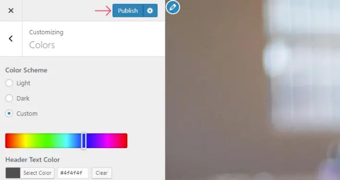
Using WordPress Theme Customizer

The WordPress Theme Customizer is a powerful tool for customizing your website’s appearance, including its colors. It offers a user-friendly interface to adjust various design elements without needing to edit code. This method provides a visual preview of your changes, ensuring you achieve the desired look before saving them.This section will detail how to use the Theme Customizer to modify colors for different parts of your website.
You’ll learn to access the customizer, navigate its color settings, and apply your choices to headers, footers, menus, and other crucial website elements. By understanding the customizer’s structure, you can effectively manage color schemes to match your brand or desired aesthetic.
Accessing the Theme Customizer
To access the Theme Customizer, you typically navigate to your WordPress dashboard. Locate the “Customize” option in the menu. Clicking on this will open the Theme Customizer panel in a new tab or window, where you can make your adjustments.
Structure of the Theme Customizer Interface for Color Settings
The Theme Customizer interface is organized into various sections. Each section corresponds to a specific website element, allowing you to modify it individually. You’ll find options to adjust colors, fonts, and other design aspects. The interface is designed to be intuitive and straightforward, allowing you to quickly identify and modify relevant settings.
Color Options Available Within the Customizer
The color options within the Theme Customizer vary depending on your specific WordPress theme. Common options include:
- Header Colors: You can typically adjust the background color, text color, and link color of your website’s header. These elements can be modified to match the overall color scheme.
- Footer Colors: Similar to the header, the footer area often allows customization of background color, text color, and link color.
- Menu Colors: Menus can have their background color, text color, and hover color adjusted. This helps integrate the menu into the overall design aesthetic.
- Button Colors: Many themes provide the option to customize the colors of buttons throughout your site, ensuring consistency with your brand’s color palette.
- Background Colors: The background color of your website can be altered, which is a key component for creating a cohesive and appealing design.
Adjusting Colors for Website Elements
To adjust colors for specific elements like headers, footers, or menus, locate the relevant section in the Theme Customizer. Typically, these are grouped under a section or tab labeled “Header,” “Footer,” “Menu,” etc. Use the color pickers or sliders provided to select your desired color. The exact approach varies between themes, but the general procedure remains the same.
Saving and Applying Custom Color Changes
Once you’ve made your color adjustments, locate the “Save Changes” button. This button is typically located near the bottom of the Customizer panel. Clicking this button will apply your modifications to your website. Important: After clicking “Save Changes,” your changes will immediately be reflected in a live preview.
Utilizing CSS for Advanced Color Customization: How To Customize Colors On Your WordPress Website
Beyond the WordPress Customizer’s intuitive color palettes, CSS offers a powerful toolkit for granular control over your website’s visual identity. This level of precision allows for tailored color schemes, specific element styling, and the creation of unique visual themes that match your brand’s aesthetic. Learning how to leverage CSS opens up a world of possibilities for advanced design and customization.CSS, or Cascading Style Sheets, is a language used to describe the presentation of web documents.
It’s essentially a set of rules that dictate how elements on a webpage should appear. By incorporating custom CSS, you can precisely adjust colors, fonts, and layouts to align with your vision.
Adding Custom CSS
Custom CSS allows for fine-tuning of colors and styles beyond the theme’s predefined options. To add custom CSS, you need to create a new CSS file and link it to your WordPress site.
Creating a Custom CSS File
First, create a new CSS file. You can use any text editor. Name the file something descriptive, like `custom-styles.css`. This file will contain the CSS rules you want to apply to your site. It’s best practice to keep this file separate from your theme’s stylesheet to maintain organization and avoid conflicts.
Placing the CSS File
There are several locations to place this file depending on your setup and desired scope. A common and straightforward approach is to place the `custom-styles.css` file in the `wp-content/themes/your-theme-name/` directory. This ensures the CSS is linked with your theme’s existing styles.
CSS Selectors and Color Values
This table demonstrates how CSS selectors target specific website elements and how to apply color values.
| Selector | Description | Color Value (Example) |
|---|---|---|
| `h1` | Targets all level 1 headings (
) |
`#FF0000` (Red) |
| `p` | Targets all paragraphs (paragraph tags) | `#00FF00` (Green) |
| `#my-element` | Targets the element with the ID “my-element” | `#0000FF` (Blue) |
| `.my-class` | Targets all elements with the class “my-class” | `#FFFF00` (Yellow) |
| `nav ul li a` | Targets all links within unordered lists inside navigation | `#008000` (Dark Green) |
Targeting Specific Elements
CSS selectors allow you to target specific HTML elements on your page. This level of specificity allows you to apply styles to only the desired elements. For example, to change the color of all `
` headings to blue, you would use the selector `h1`.
Managing Multiple Stylesheets
Managing multiple CSS stylesheets allows for targeted styling of specific sections or pages. If you have a page that requires a unique look, you can create a separate CSS file for that page and link it accordingly. This keeps your styles organized and prevents conflicts.
Employing WordPress Plugins for Color Control
WordPress plugins offer a powerful way to extend the color customization capabilities beyond what’s possible with the theme customizer and basic CSS. They provide pre-built options and often integrate seamlessly with various website elements, simplifying the process of achieving complex color schemes. This approach can save considerable time and effort, especially for users who are not proficient in CSS coding.
Popular WordPress Plugins for Advanced Color Customization
Several plugins excel at offering advanced color customization options. A good starting point is to look for plugins that offer comprehensive control over colors across your website.
- ColorPro: This plugin provides a visually intuitive interface for modifying colors in themes and plugins. It often includes a color picker, which allows you to select and preview colors in real time. You can customize elements like headings, menus, buttons, and backgrounds.
- Custom CSS and Javascript Manager: This plugin empowers you to directly inject custom CSS and JavaScript into your website, providing granular control over colors. You can tailor the appearance of every website element using targeted CSS rules.
- ThemeREX Addons: A popular plugin suite for adding functionality and customization options to various themes. It might offer a comprehensive color control system, often tailored to specific theme functionalities.
- Visual Composer: This plugin is primarily known for its page builder functionality, but it can also offer color customization options through its drag-and-drop interface, often within the page builder settings.
- SiteOrigin Page Builder: Similar to Visual Composer, this plugin provides a visual interface for creating and customizing pages, potentially with dedicated color control sections.
Comparing Plugin Features
Different plugins offer varying levels of control and ease of use. The degree of flexibility and the specific website elements they affect should be considered. For instance, some plugins might focus on controlling colors within theme elements, while others might also offer the ability to modify colors within custom post types.
| Plugin | Key Features | Ease of Use |
|---|---|---|
| ColorPro | Intuitive color picker, real-time previews, wide range of customizable elements. | High |
| Custom CSS and Javascript Manager | Granular control via custom CSS, potential for complex customizations. | Medium to High (depending on CSS knowledge) |
| ThemeREX Addons | Comprehensive customization options often theme-specific, tailored to particular theme features. | Variable |
| Visual Composer | Color control within page builder elements. | High |
| SiteOrigin Page Builder | Color control within page builder elements. | High |
Installing and Activating a Plugin
The process for installing and activating a plugin is standard across most WordPress plugins. Locate the plugin in the WordPress plugin directory, download it, and upload the plugin file to your website. Activate the plugin from your WordPress admin panel.
Using Plugin Options for Color Selection
Plugins typically provide a dedicated interface within your WordPress dashboard for managing color settings. This interface might use color pickers, sliders, or other interactive tools to select colors. Often, these tools allow you to preview your changes in real-time, helping you make informed decisions.
Applying Plugin Settings to Website Elements
Once you’ve selected your desired colors, apply them to the appropriate website elements. This might involve choosing the specific theme or plugin sections where you want to implement your color changes. The specific interface for applying changes varies between plugins, so you should consult the plugin documentation for guidance.
Color Palette Management and Consistency

Crafting a visually appealing and user-friendly website hinges on a well-defined and consistently applied color palette. A cohesive color scheme creates a strong brand identity, enhances readability, and guides the user’s eye through the content. This section dives into the strategies for building and maintaining a harmonious color system for your WordPress site.Color palettes are not just about choosing pretty colors; they’re about strategically selecting hues that reflect your brand and enhance the user experience.
Effective color management ensures your website maintains a unified look and feel across all pages, boosting brand recognition and improving user engagement.
Color Palette Collections
A well-organized collection of color palettes allows for quick selection and ensures consistency across your website. Consider creating palettes tailored to different website styles, such as a vibrant, energetic palette for a youth-oriented website or a calming, sophisticated palette for a luxury brand. This proactive approach will make future design decisions more efficient.
- Modern Minimalist: This palette utilizes a light neutral base (like off-white or light gray) paired with a contrasting accent color (perhaps a deep teal or a bold orange). This creates a clean and sophisticated look.
- Warm and Inviting: A warm palette often includes various shades of orange, yellow, and brown, creating a cozy and inviting atmosphere. Think autumn leaves or a sunset sky.
- Cool and Serene: Cool tones such as blues, greens, and purples can evoke a sense of calmness and tranquility. This palette works well for websites focused on relaxation, wellness, or nature.
- Bold and Energetic: This palette features bright, vibrant colors like crimson, turquoise, and sunshine yellow. These hues can be ideal for websites promoting energy, creativity, or a sense of excitement.
- Classic and Sophisticated: This palette uses rich, deep colors like navy blue, burgundy, and gold, creating a sophisticated and timeless feel. This approach is often favored for corporate or luxury brands.
Color Palette Comparison
A table illustrating different palettes helps in understanding their visual impact and selecting the best fit for your site. This comparison provides a clear overview of the characteristics of each palette, enabling informed choices.
| Palette Name | Primary Colors | Secondary Colors | Overall Impression |
|---|---|---|---|
| Modern Minimalist | Off-white, Light Gray | Deep Teal, Bold Orange | Clean, sophisticated, modern |
| Warm and Inviting | Various shades of orange, yellow, brown | Cream, terracotta | Cozy, inviting, autumnal |
| Cool and Serene | Blues, greens, purples | Light blues, mint greens | Calming, tranquil, nature-inspired |
| Bold and Energetic | Crimson, turquoise, sunshine yellow | Peach, coral | Exciting, vibrant, creative |
| Classic and Sophisticated | Navy blue, burgundy, gold | Cream, ivory | Sophisticated, timeless, corporate |
Maintaining Color Consistency
Maintaining a consistent color scheme across all website pages is crucial for brand recognition and a seamless user experience. Utilize a pre-defined color palette and apply it to all elements, from headings and backgrounds to buttons and links.
- Establish a style guide: Document your chosen color palette, including hex codes, RGB values, and names. This guide will be a reference for all design and development teams.
- Utilize CSS variables: This approach allows you to store color values in CSS and easily update them in one place. Modifications made to the CSS variables will instantly affect all elements using those values.
- Employ a color picker tool: These tools help maintain accurate color representation across different devices and browsers.
Color Theory in WordPress Design
Color theory principles can significantly impact your website’s design. Understanding how colors interact can create a visually appealing and harmonious website. These principles guide color choices, ensuring effective communication and aesthetic appeal.
- Color Harmony: Using colors that complement each other creates a pleasing and balanced visual effect. Analogous colors, complementary colors, and triadic colors are examples of color harmonies that can be implemented.
- Color Psychology: Different colors evoke different emotions and associations. Understanding these associations can help you choose colors that align with your brand and desired user response.
- Accessibility: Using color combinations that are easily distinguishable for users with visual impairments is vital for an inclusive website.
Accessible and User-Friendly Color Choices
Accessibility is paramount in web design. Choose color combinations that are easily distinguishable by users with visual impairments. Avoid using colors that clash or are difficult to discern.
- Sufficient Contrast: Ensure sufficient contrast between text and background colors to maintain readability for all users. Tools and guidelines can help ensure appropriate contrast levels.
- Color Blindness Considerations: Consider the potential impact of color blindness on users. Use tools to simulate color blindness and test your color choices to ensure usability for diverse audiences.
- Test with Diverse Audiences: Testing your color choices with users representing various backgrounds and abilities can provide valuable feedback.
Troubleshooting Color Issues
Color customization in WordPress, while powerful, can sometimes lead to unexpected results. Discrepancies in how colors appear across different devices, browsers, and even different versions of the same browser can be frustrating. Understanding the potential causes and having a systematic approach to diagnosis and resolution is key to achieving consistent color representation.Troubleshooting color problems in WordPress involves a multifaceted approach, combining an understanding of theme and plugin interactions, browser compatibility, and careful testing.
Identifying the root cause is often the first step to finding a solution, and this section will Artikel the common pitfalls and provide actionable strategies for resolving them.
Want to tweak the visual appeal of your WordPress site? Customizing colors is a great starting point. There are plenty of ways to adjust your site’s look, from simple theme customization options to more complex coding. If you’re looking for a more comprehensive approach to improving your online presence, exploring the services offered by a reputable digital marketing agency like those listed on digital marketing agency services list can also help elevate your website’s aesthetic and overall effectiveness.
Ultimately, mastering color customization in WordPress can significantly boost your site’s visual appeal and brand identity.
Common Color Problems and Their Causes
Color discrepancies can arise from various sources. Theme conflicts, plugin conflicts, incorrect CSS usage, and browser-specific rendering issues are some of the common culprits. A poorly coded theme or plugin might override or clash with custom color settings, leading to unexpected visual outcomes. Misinterpretations of CSS selectors, improper use of color values, or even typos in the code can result in inconsistent color display.
Want to give your WordPress site a vibrant new look? Customizing colors is a great starting point. Knowing how to adjust your color scheme can make a big difference in your website’s visual appeal. However, while you’re diving into color palettes, consider how long your blog posts should be. Researching how long should a blog post be can help you optimize for better readability and engagement.
Ultimately, the best approach to customizing your WordPress colors depends on your specific goals and target audience.
Theme and Plugin Conflicts
Theme and plugin conflicts are a frequent source of color issues. When multiple plugins or themes attempt to modify the same CSS rules, conflicts can arise. For instance, a plugin might modify the body background color, while a theme overrides it with a different value, leading to unexpected colors.
- To identify these conflicts, carefully review the plugin and theme documentation. Look for any sections detailing potential conflicts or color adjustments.
- Deactivate plugins one by one to see if the problem disappears. If a specific plugin is causing the issue, you’ll need to either modify the plugin’s code, or find a compatible alternative.
- Similarly, examine the theme’s customization options. If a theme offers customization options for colors, ensuring these options are set correctly can help avoid conflicts.
Diagnosing and Resolving Color Discrepancies
A systematic approach is crucial for diagnosing and resolving color issues. Start by isolating the problem area. If the issue is specific to a particular page or section, narrow down the codebase that controls that area. This focused approach can significantly expedite the troubleshooting process.
- Inspect the affected elements: Use your browser’s developer tools to inspect the affected elements and their associated CSS rules. Verify that the expected color values are correctly applied.
- Check for CSS conflicts: Carefully examine the CSS code for any conflicting rules that might be overriding intended color settings. Look for overlapping selectors or conflicting properties.
- Test in different browsers and devices: Ensure that the color display is consistent across different browsers (Chrome, Firefox, Safari) and various devices (desktops, tablets, mobile phones). Inconsistencies often point to browser-specific rendering issues.

Color Display Across Devices and Browsers
Color display varies across devices and browsers due to differences in rendering engines and color profiles. Some browsers might interpret colors differently than others, leading to inconsistencies. This is especially important for web design.
- Employing a color palette that uses well-defined hexadecimal values (e.g., #FF0000 for red) can minimize interpretation issues. Using color palettes and tools can assist in ensuring consistency.
- Test color accuracy across different devices to pinpoint inconsistencies and ensure a consistent visual experience. This includes desktop computers, laptops, tablets, and smartphones.
Browser Compatibility
Browser compatibility plays a critical role in ensuring consistent color display. Different browsers interpret CSS rules differently, leading to potential color discrepancies.
Careful attention to browser compatibility, combined with rigorous testing across different browsers, is essential for maintaining color consistency.
Responsive Color Adjustments
Customizing colors for a WordPress website isn’t just about picking pretty hues; it’s about ensuring your site looks fantastic on every device. Responsive color adjustments are crucial for maintaining visual appeal and usability across various screen sizes, from sprawling desktops to compact mobile phones. A well-designed color scheme adapts seamlessly, preventing jarring visual inconsistencies.Effective color customization considers the varying screen resolutions and aspect ratios of different devices.
This ensures your website visitors experience a consistent visual experience, regardless of their device. Adapting colors to the specific screen size of a device is key to achieving a responsive and user-friendly design.
Importance of Responsive Color Customization
A responsive color scheme is vital for providing a seamless user experience. It ensures your site’s visual appeal and usability remain consistent across all devices. By adapting to different screen sizes, the site remains aesthetically pleasing and functional, avoiding visual discomfort or usability issues. This leads to a more engaging and satisfying experience for the visitor.
Adjusting Colors for Different Screen Sizes and Resolutions
Adjusting colors for various screen sizes and resolutions is achieved using media queries in CSS. Media queries allow you to apply different styles based on factors like screen width, height, orientation, and device type. This approach lets you fine-tune colors for each device category, ensuring optimal display.
Using Media Queries in CSS for Responsive Colors
Media queries in CSS are the fundamental tools for responsive color adjustments. They allow you to define different styles for various screen sizes. The following example shows how to adjust a background color based on screen width.
Want to give your WordPress site a vibrant new look? Customizing colors is a great starting point, and it’s surprisingly easy! A key element in a successful marketing campaign, especially for account-based marketing campaigns like the ones discussed in this excellent resource on strategy for account based marketing campaign , is a visually appealing website. By tweaking your site’s color scheme, you can effectively reinforce your brand identity and create a more engaging experience for your visitors.
Plus, a consistent color palette makes your site look professional and polished, making your website work harder for you.
@media (max-width: 768px) body background-color: #f0f0f0; /* Light gray for smaller screens – / @media (min-width: 769px) body background-color: #ffffff; /* White for larger screens – /
This code snippet changes the background color to light gray for screens 768 pixels or less in width, and to white for screens wider than 768 pixels. This is a simple example; you can adjust the width values and background colors to suit your needs.
Responsive Color Table Design
To illustrate how colors adapt, consider this table demonstrating different background colors based on screen size.
| Screen Size | Background Color |
|---|---|
| Mobile (max-width: 480px) | Light Blue (#ADD8E6) |
| Tablet (481px – 768px) | Light Gray (#F0F0F0) |
| Desktop (min-width: 769px) | White (#FFFFFF) |
This table visually represents the responsive color adjustments. By defining different colors for different screen sizes, the website adapts to the device, enhancing the visual experience. Each color is carefully selected to ensure readability and visual appeal for each screen size.
Ensuring Good Color Appearance Across Devices
Ensuring colors look good across various devices involves careful consideration of color palettes, device calibration, and accessibility. A color palette that’s harmonious on different displays will look good on desktops, tablets, and mobile devices. You must also consider color contrast ratios for accessibility, making sure text is legible on various screens. Testing on different devices and browsers helps to ensure your colors render as intended.
Advanced Techniques and Best Practices
Mastering color customization in WordPress goes beyond simply picking pleasing hues. It involves understanding the psychological impact of colors, accessibility considerations, and strategic application for optimal user experience. This section delves into advanced techniques and best practices to elevate your website’s visual appeal and functionality.Effective color schemes not only enhance aesthetics but also communicate a brand’s personality and resonate with the target audience.
This requires a deep understanding of color theory, contrast principles, and how different color combinations impact user engagement.
Creating Visually Appealing and Functional Color Schemes
Color palettes should be thoughtfully chosen, reflecting the website’s purpose and brand identity. A harmonious balance between primary, secondary, and accent colors is crucial for visual appeal. Avoid overwhelming the viewer with too many colors, opting instead for a limited palette that effectively conveys your message. Consider the use of color psychology to select colors that evoke desired emotions and associations.
Using Color Contrast Tools for Accessibility
Ensuring sufficient color contrast is vital for website accessibility. Users with visual impairments, including those with low vision, may have difficulty discerning text against a background if the contrast is insufficient. Utilizing color contrast tools, like WebAIM’s Color Contrast Checker, is essential to verify compliance with accessibility guidelines. These tools evaluate the contrast ratio between foreground and background colors, helping ensure readability and usability for all users.
A contrast ratio of 4.5:1 or greater is typically recommended for normal text.
Best Practices for Selecting Colors Based on Target Audience
Color preferences vary significantly among different demographics. Consider your target audience’s background, cultural context, and personal preferences when choosing colors. For example, certain colors might evoke different emotions or associations in different cultural settings. Thorough research into your target audience’s preferences and understanding their psychographic characteristics are essential. Understanding cultural nuances can improve the effectiveness of your color choices and create a more inclusive and welcoming experience.
Color Palette Management and Consistency
Maintain consistency in your color usage across all website elements. This includes header, footer, buttons, links, and other crucial elements. Using a dedicated color palette or style guide can be helpful. This approach ensures a unified and recognizable brand identity, while making the website easier to navigate.
Resources for Further Learning about Color Theory and Web Design
Numerous resources provide valuable insights into color theory and web design principles. Websites like Adobe Color, Canva, and Coolors offer color palettes and tools to inspire and assist in color selection. Books on color theory and web design best practices can offer a deeper understanding of the principles and their application. Furthermore, online courses and tutorials provide practical knowledge and hands-on experience in implementing color schemes effectively.
Professional design communities and forums can also provide helpful insights and feedback.
Comparison of Different Color Schemes and Suitability
Different color schemes can effectively communicate different messages and evoke various emotional responses. A monochromatic color scheme, using different shades and tones of a single color, creates a sophisticated and elegant feel. A complementary color scheme, using colors opposite each other on the color wheel, creates a vibrant and energetic atmosphere. Analogous color schemes, using colors adjacent to each other on the color wheel, create a harmonious and calming effect.
Consider the purpose of your website and the desired impact when selecting a color scheme. A website selling luxury items, for example, might benefit from a monochromatic or complementary color scheme, while a vibrant and interactive website for a gaming company might use an analogous color scheme.
Wrap-Up
Mastering WordPress color customization empowers you to craft a website that reflects your brand, engages visitors, and maintains a cohesive visual identity. From basic theme adjustments to sophisticated CSS manipulations and plugin integration, this guide equips you with the knowledge and tools to achieve professional-looking results. Remember to prioritize accessibility and responsive design for an optimal user experience across all devices.