
How to easily serve scaled images in WordPress is crucial for a fast, responsive website. Images are often the largest files on a site, and if not handled correctly, they can significantly slow down loading times. This guide will delve into optimizing image sizes, choosing the right formats, and implementing responsive image techniques to ensure your WordPress site is lightning-fast and delivers a seamless user experience, regardless of the device being used.
We’ll explore various WordPress image optimization techniques, from choosing the perfect image formats to utilizing plugins and configuring image sizes for optimal scaling. Understanding how to implement responsive images in your WordPress themes is also essential, leveraging HTML attributes like srcset and sizes to deliver the ideal image size for each device. We’ll also discuss different methods for serving scaled images, including the built-in WordPress functionality, plugin-based approaches, and the benefits of using a Content Delivery Network (CDN).
This comprehensive approach will cover everything from the basics to advanced techniques, helping you troubleshoot any issues that may arise and ultimately achieve a highly optimized image delivery system for your WordPress site.
Introduction to Scaled Images in WordPress
Responsive images are crucial for modern WordPress websites. They automatically adjust to different screen sizes, ensuring optimal viewing experiences across various devices like desktops, tablets, and smartphones. This adaptability is vital for maintaining a positive user experience and preventing slow loading times. The key is using scaled images that are appropriately sized for each device, optimizing performance and reducing bandwidth usage.By strategically scaling images, websites can improve loading speed and user experience.
Faster loading times translate to happier visitors who are less likely to abandon a site. Proper scaling ensures that images don’t consume excessive bandwidth, which can reduce costs and improve site performance. This translates into a more efficient and engaging online experience for users.
Benefits of Using Scaled Images
Implementing scaled images offers numerous advantages for WordPress websites. They contribute to a better user experience and enhanced site performance. Optimizing image sizes for various screen resolutions reduces page load times, leading to increased user engagement. A seamless user experience results in higher visitor satisfaction and improved rankings. Optimized images also minimize bandwidth usage, lowering hosting costs and contributing to a more sustainable online presence.
Optimizing image sizes for WordPress is crucial for speed and user experience. Using plugins like ShortPixel or similar tools can easily resize images on the fly, ensuring they load quickly. This is especially important now, considering the upcoming sunset of the Google Ads API v17, which might impact your ad strategies. Luckily, proper image scaling can help by reducing page load times, improving SEO, and generally making your website more user-friendly.
Finding the right tools to easily serve scaled images is key.
Common Issues Encountered with Images in WordPress
Several challenges arise when handling images on WordPress sites. Large, unoptimized images can significantly impact page load times, hindering user experience. This can lead to a negative user experience, reflected in increased bounce rates and decreased conversion rates. Images that are too large for their intended use also lead to wasted bandwidth. Furthermore, inappropriate image formats can also cause problems.
Choosing the wrong format can result in compromised image quality or larger file sizes, affecting loading speed and overall site performance.
Different Image Formats and Their Suitability for Scaling
Different image formats have varying characteristics, influencing their suitability for scaling. The choice of format impacts the balance between image quality and file size. JPEG, PNG, and WebP are common image formats with different strengths and weaknesses when it comes to scaling. Understanding these differences is critical for optimizing image performance and ensuring a positive user experience.
| Format | Pros for Scaling | Cons for Scaling |
|---|---|---|
| JPEG | Good compression, suitable for photos. Preserves color fidelity well, especially in photos. | Lossy compression, may lose quality when scaled repeatedly. Not ideal for graphics with sharp edges or text. |
| PNG | Lossless compression, good for graphics, maintains quality during scaling. Ideal for images with sharp edges, logos, and text. | Larger file size than JPEG, particularly for complex images. Not as good for photographs as JPEG. |
| WebP | Excellent compression, good for both photos and graphics, generally smaller file size than JPEG and PNG. Supports transparency and animation. | Not universally supported yet by all browsers and devices, although this is improving rapidly. May require some fallback mechanisms for older browsers. |
WordPress Image Optimization Techniques
Optimizing images for web use is crucial for a fast-loading website. Large image files can significantly slow down page load times, impacting user experience and search engine rankings. Efficient image optimization techniques are essential for WordPress sites to ensure images display correctly and load quickly.Proper image optimization not only improves website performance but also contributes to a better user experience, making your site more user-friendly and potentially increasing engagement.
This includes techniques for scaling images effectively while maintaining quality, using appropriate image formats, and employing plugins to streamline the process.
Image Compression Techniques
Various image compression techniques can significantly reduce file sizes without sacrificing visual quality. Lossy compression methods, like JPEG, discard some image data to achieve smaller file sizes. Lossless compression methods, such as PNG, retain all image data, resulting in larger files but better quality, especially for graphics and text. Choosing the right compression method depends on the image’s content.
For photographs, JPEG often offers the best balance between file size and quality. For illustrations or graphics with sharp lines and solid colors, PNG is often a better choice.
Plugin Use for Image Optimization
Plugins offer automated solutions for optimizing images within WordPress. They often handle resizing, compression, and format conversion, saving you time and effort. This automated approach is beneficial for large-scale image management. Using plugins effectively streamlines the optimization process, ensuring your images are ready for the web.
Recommended Image Optimization Plugins
- Smush: A popular and widely used plugin, Smush provides advanced image optimization features, including compression and resizing. It offers various options for different image types, ensuring optimal results for different content. It also helps with lazy loading, reducing initial page load times.
- ShortPixel: Another highly-regarded option, ShortPixel utilizes sophisticated algorithms for image compression. It focuses on preserving image quality while minimizing file size, making it a reliable choice for various image types and sizes.
- WP Smush.it: This plugin offers a user-friendly interface, making image optimization accessible to users with varying levels of technical expertise. It works seamlessly with existing image formats, offering a streamlined optimization process.
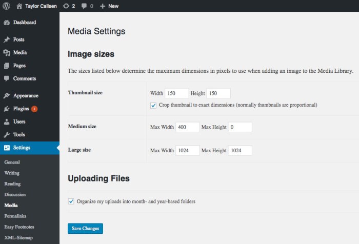
Configuring Image Sizes and Dimensions
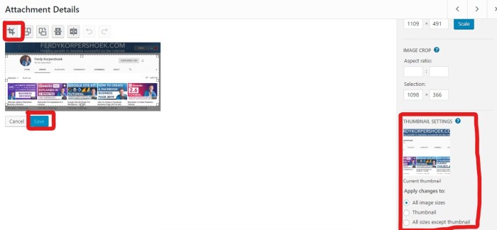
Properly configuring image sizes and dimensions is essential for optimal scaling. Using different image sizes for different display areas (e.g., thumbnails, featured images, full-size images) reduces overall file sizes while maintaining image quality. This method of selective resizing is crucial to reduce server load and improve page load speed.
Choosing the Correct Image Formats
The choice of image format significantly impacts file size and quality. JPEG is suitable for photographs where some loss of quality is acceptable. PNG is preferred for graphics, logos, and images with sharp lines and solid colors. WebP, a modern format, combines the advantages of both, offering high compression and quality. Selecting the appropriate format ensures optimal performance and image quality.
Comparison of Image Optimization Plugins
| Plugin | Features | Pros | Cons |
|---|---|---|---|
| Smush | Lossy and lossless compression, resizing, lazy loading | Widely used, effective, good support | Can be slightly more complex for beginners |
| ShortPixel | Advanced compression algorithms, various optimization options | High quality output, excellent compression | Can be slightly more expensive |
| WP Smush.it | User-friendly interface, straightforward optimization | Easy to use, quick results | Might not have the most advanced features |
Implementing Responsive Images in WordPress Themes
Responsive images are crucial for modern web design, ensuring optimal viewing experiences across diverse devices. They dynamically adjust their size and resolution based on the user’s screen, preventing blurry or oversized images on smaller screens. This approach not only enhances user experience but also improves website performance by loading only the necessary image data. WordPress provides several ways to achieve this responsiveness, which we’ll explore in detail.Implementing responsive images within WordPress themes is a straightforward process, leveraging the theme’s existing image handling mechanisms and HTML attributes.
By correctly using `srcset` and `sizes` attributes, we can guide the browser to choose the most appropriate image variant for different devices, improving page load times and visual appeal.
Using the `image_tag` Function for Responsive Images
The `image_tag` function in WordPress is a powerful tool for displaying images. It can automatically generate responsive images by incorporating the `srcset` and `sizes` attributes directly into the image tag. This eliminates the need for manual intervention, streamlining the process and reducing the risk of errors.
Optimizing Image Sizes for Different Devices
Handling various image sizes for different devices is essential for a positive user experience. Users viewing the site on a desktop computer will likely benefit from a high-resolution image, while mobile users may prefer a smaller, optimized version. A key element is ensuring that the correct image size is loaded for each device. This strategy helps to optimize page load times and improves website performance.
- Desktop Images: For high-resolution displays, larger images provide the best visual quality. These images should maintain the highest possible resolution while remaining optimized for fast loading.
- Tablet Images: Tablets typically fall between the resolution of desktops and mobile phones. Images for tablets should maintain a balance between quality and size. A slightly smaller image than desktop, but larger than mobile, is ideal.
- Mobile Images: Mobile devices often have lower screen resolutions. Mobile-optimized images should be smaller in size and lower in resolution to load quickly. Compromises in quality should be minimal.
Employing `srcset` and `sizes` Attributes
The `srcset` attribute specifies multiple image sources with different resolutions, allowing the browser to select the most appropriate one. The `sizes` attribute provides additional information to the browser about the image’s intended size, helping it make an informed choice.
The `srcset` attribute is essential for creating responsive images. It allows the browser to select the image with the best resolution for the user’s device.
These attributes are crucial for achieving optimal image display. Proper use of `srcset` and `sizes` is key to providing the user with the best possible viewing experience. This is crucial to maintaining a positive user experience and improving . Browsers use this information to select the best-fitting image for the current viewport, optimizing display and loading times.
Example of `image_tag` Function with `srcset` and `sizes`
“` wp_get_attachment_image_srcset(get_post_thumbnail_id($post->ID), ‘large’), ‘sizes’ => wp_get_attachment_image_sizes(get_post_thumbnail_id($post->ID), ‘large’),);echo wp_get_attachment_image(get_post_thumbnail_id($post->ID), ‘large’, false, $image_attributes);?>“`This example demonstrates how to dynamically generate responsive image tags within a WordPress theme, using the `image_tag` function to create image attributes. Using `wp_get_attachment_image_srcset` and `wp_get_attachment_image_sizes` from WordPress core functions is essential to ensure compatibility. It ensures correct sizing and resolution for images across different screen sizes.
Serving Scaled Images Efficiently
Delivering optimized images is crucial for a fast-loading website. Users expect immediate access to content, and slow image loading significantly impacts user experience and search engine rankings. Efficiently serving scaled images is a key component of this optimization process. This involves choosing the right techniques to deliver the precise image size needed for each device and screen resolution.The methods for serving scaled images in WordPress have evolved, each with its own strengths and weaknesses.
Understanding these nuances allows website owners to make informed decisions that prioritize both performance and ease of implementation. This section delves into different approaches, their performance characteristics, and best practices for achieving optimal image loading times.
Different Methods for Serving Scaled Images, How to easily serve scaled images in wordpress
Various methods exist for delivering scaled images, each impacting website performance in unique ways. Understanding these differences is essential for selecting the most suitable approach.
- WordPress Built-in: WordPress inherently supports serving different image sizes. This built-in capability allows for quick setup and avoids the need for additional plugins. However, it can lead to redundancy if not managed correctly, resulting in potentially larger file sizes than necessary. This method is simple but may not provide the most granular control over image scaling, potentially leading to suboptimal performance.
- Plugin-Based Solutions: Several plugins offer advanced image scaling and optimization capabilities. These plugins often provide more control over image resizing, compression, and delivery. They frequently offer more flexibility for handling diverse image needs, especially for websites with a high volume of images. The increased control and customization often come with a tradeoff, potentially adding complexity to the website’s architecture and requiring extra maintenance.
- CDN (Content Delivery Network): CDNs significantly improve image loading times by caching images on servers closer to users. This strategy reduces latency and enhances the user experience by making images load faster. CDNs offer substantial performance improvements for sites with high traffic and global user bases. However, they often incur costs associated with their services.
Performance Comparison of Methods
The performance characteristics of each image serving method are critical to consider. Factors like loading time, file size, and bandwidth consumption must be weighed against the complexity of implementation.
| Method | Pros | Cons |
|---|---|---|
| WordPress Built-in | Easy implementation, no additional plugins required. | Potentially less efficient, may not handle complex scaling needs. |
| Plugin-Based | Increased control and flexibility over scaling and optimization, often includes additional features like lazy loading. | Might add complexity to website architecture and require extra maintenance. |
| CDN | Significant speed improvements, reduced latency, improved user experience, often includes security benefits. | Costs involved, potentially higher initial setup complexity. |
The Role of Caching Mechanisms
Caching mechanisms play a vital role in serving scaled images efficiently. Caching reduces the workload on the origin server by storing frequently accessed data. This reduces server load and ensures faster image delivery.Caching images locally on the server or with a CDN can drastically reduce loading times for repeat visitors. Implementing a proper caching strategy, whether built into the website’s architecture or through a CDN, is a crucial aspect of optimizing image delivery.
Using CDNs for Image Loading Speed
CDNs, or Content Delivery Networks, are a powerful tool for improving image loading speed. They distribute content across multiple servers globally, enabling users to access images from servers closer to their location. This drastically reduces latency and improves the user experience, especially for international users.
Most Efficient Approach for Scaled Images in WordPress
The most efficient approach often combines multiple strategies. Utilizing a CDN for global image delivery and employing a plugin for advanced image optimization offers the best balance of performance and ease of implementation. This approach leverages the speed and efficiency of a CDN while providing fine-grained control over image optimization with a plugin. By carefully considering the specific needs of a website, a combination of methods can be selected to ensure the fastest possible loading times for images.
Troubleshooting Common Issues: How To Easily Serve Scaled Images In WordPress
Serving scaled images efficiently in WordPress can sometimes present challenges. Identifying and resolving these issues is crucial for maintaining optimal website performance. This section delves into common problems, their diagnosis, and effective solutions, ensuring smooth image delivery and a positive user experience.Common problems encountered when serving scaled images include slow loading times, incorrect image dimensions, and compatibility issues with different devices and browsers.
Understanding the root causes of these issues is the first step towards effective troubleshooting.
Slow Loading Times
Slow loading times are a frequent issue when dealing with scaled images. Several factors contribute to this problem, including oversized images, inefficient image formats, and inadequate server resources. A crucial step is to identify the bottleneck causing the delay. Image optimization techniques play a key role in resolving this issue.
- Image Size Optimization: Reducing image file sizes without compromising visual quality is paramount. Utilize image compression tools and formats like WebP, which often provide significant reductions in file size compared to JPEG. Appropriate image dimensions for different screen sizes are also important to consider.
- Server Response Time: A slow server response time can directly impact image loading. Ensure your server has sufficient resources and consider caching mechanisms to reduce the time taken to deliver images.
- Network Latency: Network issues can also affect image loading times. Test your website’s speed and identify potential network bottlenecks. Consider a Content Delivery Network (CDN) to distribute images across multiple servers, thereby minimizing latency.

Incorrect Image Dimensions
Incorrect image dimensions can lead to distorted or poorly rendered images on different devices. Responsive image techniques are vital for ensuring images adapt to various screen sizes.
Optimizing image sizes in WordPress is crucial for speed and SEO. Using plugins like ShortPixel or similar tools can easily resize images for different screen sizes, cutting down file sizes without compromising quality. Understanding how Google ranks pages is also key, which is why I highly recommend checking out this beginners guide to understanding Google Pagerank for SEO beginners guide to understanding google pagerank for seo.
This knowledge will help you create content that’s both visually appealing and search engine friendly, ultimately improving your overall site performance.
- Incorrect Image Sizes in Themes: Themes might contain incorrect image dimensions, resulting in scaling issues. Inspect the theme files for any size specifications that are causing problems. Using responsive image techniques, the images can be scaled to the correct dimensions dynamically.
- Using Incorrect Scaling Techniques: If scaling techniques are not implemented correctly, the images might not scale properly, leading to poor visual quality. Use proper responsive image plugins to automate the scaling process for different screen sizes.
- Missing or Incorrect CSS: Improper or missing CSS rules can lead to incorrect image dimensions and positioning. Carefully review and debug the CSS files related to image display.
Debugging Tools
Debugging tools are indispensable in identifying and resolving image-related problems. These tools provide insights into various aspects of the website’s performance.
Want to supercharge your WordPress image display? Optimizing images for different screen sizes is key. Tools like those found at google business profile management tools might seem unrelated, but they both revolve around presenting content efficiently. Efficient image serving directly impacts your site’s performance, which is vital for a great user experience. You’ll see a boost in page load speed and improved SEO by optimizing your image delivery process.
- Browser Developer Tools: Browser developer tools offer detailed information on network requests, resource loading times, and image dimensions. Inspect the network tab to understand image loading behavior and identify any delays.
- Performance Monitoring Tools: Performance monitoring tools provide comprehensive insights into website performance. Tools like Google PageSpeed Insights and GTmetrix provide detailed reports on image optimization and loading times. These reports are valuable in identifying potential bottlenecks.
Scaling Errors
Scaling errors can manifest in various forms, such as pixelation, distortion, or blurring. Using appropriate scaling techniques and ensuring image quality are crucial to avoid these problems.
- Incorrect Resampling Algorithms: Inappropriate resampling algorithms can lead to image quality degradation during scaling. Choosing the right algorithm for the task is critical.
- Exceeding Image Resolution: Scaling images beyond their resolution can lead to pixelation and blurring. Maintain appropriate image resolutions for different uses.
- Image Format Compatibility: Ensure the image format is compatible with the scaling process. Using WebP or other optimized formats can help prevent scaling errors.
Advanced Techniques for Scaling Images
Optimizing images for responsive design goes beyond basic scaling. Advanced techniques focus on preserving image quality while drastically reducing file sizes, crucial for fast loading times and a seamless user experience. These methods often involve pre-emptive image manipulation, leveraging image editing software, and employing custom coding for complex scenarios.Understanding the interplay between image dimensions, file formats, and compression is paramount for effective image scaling.
Choosing the right tools and techniques will ensure that your scaled images are not only visually appealing but also contribute to a positive user experience.
Image Editing Software for Pre-Scaling
Image editing software like Adobe Photoshop, GIMP, or even dedicated online tools offer powerful tools for optimizing images before scaling. These programs allow for precise control over image quality and compression, reducing file sizes without sacrificing visual fidelity. For example, adjusting the color profile, reducing resolution, and choosing the correct file format (JPEG, PNG, WebP) can significantly impact the final image size.
These pre-emptive measures ensure that the scaling process doesn’t introduce unnecessary quality loss. Additionally, features like smart objects in Photoshop can preserve layers and effects, enabling non-destructive editing and scaling.
Advanced Image Optimization Techniques
Several advanced optimization techniques can enhance image scaling results. These strategies focus on minimizing file sizes while preserving visual quality. Using appropriate compression algorithms (e.g., lossy JPEG for photographs, lossless PNG for graphics) is critical. Advanced tools often provide options to fine-tune the compression level to achieve the desired balance between file size and quality. Additionally, employing modern image formats like WebP, which often offer better compression than traditional JPEGs, can yield significant reductions in file size.
Creative Image Scaling Techniques
Beyond standard scaling, creative techniques can enhance image presentation. Using image cropping strategically can improve the focus of the image, ensuring that the most relevant elements are displayed at various screen sizes. Additionally, image masking can create a unique look, especially when used in conjunction with specific scaling techniques. For example, masking a specific portion of an image before scaling and then presenting it in a smaller size could create a unique visual effect.
Custom Code for Complex Scaling Tasks
For more complex scaling tasks or specific design requirements, custom code can be a powerful tool. Plugins and custom functions within WordPress can automate scaling processes and apply unique transformations to images. For example, a plugin can resize images based on the device’s screen size or generate multiple scaled versions of an image automatically. Custom code can also perform tasks like creating responsive image placeholders or handling image variations based on user roles.
Image Formats and Compression
Understanding different image formats and their compression methods is essential for optimizing scaling. JPEGs are good for photographs, offering good balance between quality and size, but are lossy. PNGs are generally better for graphics, maintaining quality without compression loss. WebP is a modern format that combines the benefits of both, providing superior compression in many cases. Choosing the appropriate format and compression level is crucial to minimizing file size while maintaining image quality.
Last Word

In conclusion, serving scaled images effectively in WordPress is a multi-faceted process requiring careful consideration of image formats, optimization techniques, responsive design, and efficient serving methods. By following the strategies Artikeld in this guide, you can dramatically improve your website’s performance and user experience. From choosing the right plugins to implementing responsive image techniques, this guide equips you with the knowledge to ensure your images load quickly and flawlessly across all devices.
Remember to monitor performance and troubleshoot any issues to maintain a top-notch user experience.

