How to use heat mapping in user experience design is a powerful technique for understanding user behavior on websites and apps. It reveals where users click, scroll, and linger, offering invaluable data for improving design and enhancing the user experience. This guide delves into the world of heatmaps, from understanding different types to interpreting results and applying insights for better design.
By understanding the principles behind heatmaps, designers can gain valuable insights into user interactions. This process involves analyzing click patterns, scroll depth, and other key metrics to identify areas of interest, confusion, or frustration. The information gained through heatmap analysis can be used to optimize the layout, navigation, and overall user flow, ultimately leading to a more effective and user-friendly design.
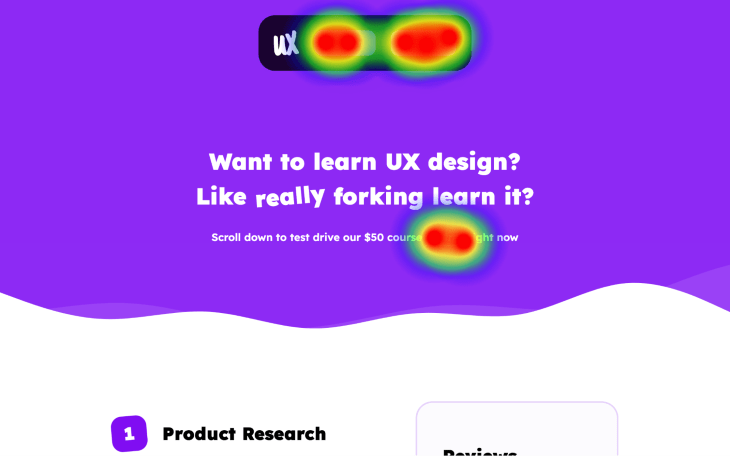
Introduction to Heatmaps in UX Design

Heatmaps are powerful visual tools in UX design that reveal user behavior patterns on a website or app. They provide insights into where users focus their attention, what areas they interact with most, and which parts of a design are ineffective or confusing. Understanding these patterns helps designers optimize user experience, making interfaces more intuitive and user-friendly.Heatmaps visualize user interaction data, like clicks, scrolls, and mouse movements, across a digital interface.
By highlighting areas with high interaction frequency, heatmaps pinpoint crucial elements that resonate with users and areas that need improvement. This actionable data empowers designers to make informed decisions regarding interface design and user flow.
Different Types of Heatmaps
Heatmaps come in various forms, each providing a unique perspective on user behavior. Understanding these types helps tailor the analysis to specific design goals.
- Clickmaps: These heatmaps visually represent where users click on a page. Areas with high click density highlight the most engaging elements, while areas with few clicks signal potential usability issues or areas users may be overlooking.
- Scrollmaps: Scrollmaps depict how far users scroll down a page. They reveal the portion of the content that users engage with, pinpointing areas of high and low engagement. This information is critical for content optimization, helping to prioritize what information should be more prominent on a page.
- Scroll Depth: Scroll depth heatmaps, a specific type of scrollmap, reveal how far down a page users scroll, which segments are most interacted with. This allows for the identification of where users are dropping off or losing interest in the content.
Heatmaps vs. Other Usability Testing Methods
Heatmaps provide a quick and insightful overview of user behavior, but they are not a replacement for other usability testing methods. They work best in conjunction with these methods to gain a comprehensive understanding of user experience.
| Method | Purpose | Data Collected | Typical Use Cases |
|---|---|---|---|
| Heatmaps | Identify areas of high and low user interaction | Click data, scroll paths, mouse movements | Early-stage design feedback, evaluating page layouts, identifying areas for improvement, assessing the effectiveness of design elements |
| Usability Testing | Assess user experience and identify pain points | User feedback, task completion rates, time spent on tasks, user interviews | Thorough evaluation of the overall user journey, finding areas of friction, testing hypotheses, gathering qualitative data |
| Eye-Tracking | Understand user attention and focus | Eye movements, gaze duration, fixation points | Analyzing user attention patterns, identifying distractions, understanding how users scan content, assessing the effectiveness of visual hierarchy |
| A/B Testing | Compare different design variations | Conversion rates, click-through rates, user engagement metrics | Comparing alternative designs to measure impact, testing different calls-to-action, optimizing conversion funnels |
Heatmaps, while valuable, offer a limited perspective compared to comprehensive usability testing methods. For example, they don’t capture the qualitative feedback users provide during usability testing, which is crucial for understanding the “why” behind their actions. Combining heatmaps with other methods provides a richer, more nuanced understanding of user behavior and needs.
Gathering Data with Heatmaps

Heatmaps are powerful tools for understanding user behavior on websites and applications. They provide visual representations of where users click, scroll, and spend the most time. This data is invaluable for UX designers, allowing them to identify areas of a design that are confusing, engaging, or simply not effective. Collecting this data accurately is crucial for making informed decisions and improving the overall user experience.Implementing heatmap tools requires a careful process, from choosing the right tool to interpreting the data ethically.
Understanding the different tools available and their limitations is key to successful implementation. The ethical implications of gathering user data also play a significant role, emphasizing the importance of user consent and data privacy.
Implementing Heatmap Tools
To integrate heatmap tools into your website or application, you typically need to embed a snippet of JavaScript code provided by the chosen heatmap service. This code tracks user interactions as they navigate your site, recording mouse movements, clicks, and scrolling patterns. The exact implementation process depends on the tool you select, so always refer to the tool’s documentation.
Different tools may require varying levels of technical expertise.
Examples of Heatmap Tools
Several tools are available for collecting heatmap data, each with its own set of strengths and weaknesses.
- Hotjar: A popular choice known for its comprehensive suite of features, including heatmaps, session recordings, and surveys. It offers detailed visual representations of user interactions, allowing for a deep dive into user behavior. Hotjar provides various ways to segment and filter data, making it easier to analyze specific user groups or behaviors. A potential drawback is the learning curve for some users.
It provides excellent support and tutorials, however.
- Crazy Egg: Another well-regarded tool that focuses primarily on heatmaps and scroll maps. It’s user-friendly and straightforward to use, making it suitable for both beginners and experienced designers. A strength is its ability to quickly generate clear heatmaps showing where users are clicking and scrolling. One limitation is its lack of detailed session recordings compared to some other tools.
This could be a disadvantage for in-depth user behavior analysis.
- Mouseflow: A tool that combines heatmaps with session recordings and user behavior analysis. This allows for a holistic view of the user journey. Mouseflow provides detailed data on user interactions, such as mouse movements, click patterns, and form submissions. A potential drawback is that the tool may require more technical expertise to set up compared to simpler alternatives.
Ethical Considerations in Heatmap Use
The collection and use of user data through heatmaps raise ethical considerations. Ensuring user consent is paramount. Transparent communication with users about how their data will be used is crucial for building trust.
User Consent
Obtaining explicit user consent is essential for any heatmap study. Users must be clearly informed about the purpose of data collection, how the data will be used, and how their privacy will be protected. This consent should be easily accessible and clearly articulated on the website. Implementing a clear consent mechanism, like a pop-up or checkbox, is crucial.
Heatmap Tool Comparison
| Tool | Supported Platforms | Data Visualization Options | Pricing |
|---|---|---|---|
| Hotjar | Web applications | Heatmaps, session recordings, surveys, form analytics | Free trial, various paid plans |
| Crazy Egg | Web applications | Heatmaps, scroll maps, A/B testing | Free trial, various paid plans |
| Mouseflow | Web applications | Heatmaps, session recordings, user behavior analysis | Free trial, various paid plans |
Interpreting Heatmap Data
Heatmaps, with their visual representation of user interactions, offer a wealth of insights into user behavior. However, raw data points don’t automatically translate into actionable design improvements. Effective interpretation requires a careful examination of patterns, trends, and the context surrounding user activity. This section delves into the crucial aspects of extracting meaningful information from heatmap visualizations.Understanding the nuances of heatmap patterns and their connection to user behavior is key to making informed design decisions.
Recognizing the common pitfalls in interpretation will also help ensure that conclusions drawn from the data are accurate and reliable.
Identifying Patterns and Trends
Heatmaps reveal patterns in user interactions, providing a visual representation of where users spend the most time and focus their attention. Identifying these patterns involves scrutinizing the density of color variations across the heatmap. High concentrations of color in specific areas indicate areas of high user engagement, while low concentrations point to areas of disinterest or confusion. By observing these patterns, designers can pinpoint elements that are effective and those that need improvement.
Careful analysis of these patterns can reveal areas where users might be struggling to find what they need or how to navigate the interface.
Examples of Common Heatmap Patterns and Their Implications
Common heatmap patterns provide valuable insights into user behavior. A significant cluster of clicks on a specific button, for instance, indicates a highly utilized and potentially important function. Conversely, areas of low scrolling or inactivity might signal a lack of interest or a potential design flaw, possibly an unclear or poorly-placed call to action.
Context in Heatmap Interpretation
Interpreting heatmap data requires careful consideration of the context surrounding the user’s interaction. For example, a large amount of heat on a specific form field might indicate that the field is necessary and well-understood by the user. Alternatively, a large amount of heat on a form field might indicate confusion about what the field is meant for, or even indicate the need for additional instructions.
The surrounding design elements and the specific task at hand should always be taken into account.
Heatmaps and User Behavior
Heatmaps provide a direct visualization of user behavior. High interaction in specific areas correlates with users engaging with that content or function. Areas of low activity can suggest that the content or functionality is not appealing, confusing, or perhaps even irrelevant to the user’s needs.
Pitfalls in Heatmap Interpretation
Several pitfalls can lead to inaccurate interpretations of heatmap data. One common error is assuming causation instead of correlation. A high click-through rate on a button doesn’t automatically mean that the button is well-designed; it might simply be in a prominent position. Similarly, a lack of activity in a section might be due to insufficient visual cues, rather than a problem with the design itself.
Heat mapping is a fantastic tool for UX designers to understand user behavior on a website. By tracking where users click and scroll, you can identify pain points and optimize the user journey. This is super helpful for improving website usability. Similarly, understanding how users interact with your content can help measure content marketing success, like identifying popular pages and areas for improvement measure content marketing success.
Ultimately, using heatmaps provides crucial data to refine the user experience and make your site more effective.
Heatmap Patterns and User Behavior Examples
| Heatmap Pattern | User Behavior Interpretation |
|---|---|
| High clicks on a specific button | Users frequently interact with this button, potentially indicating a valuable function or an intuitive call to action. |
| Low scrolling in a specific section | Users may not be engaging with this section of the page, suggesting the content might be uninteresting, confusing, or poorly presented. |
| High heatmap intensity around a specific error message | Users are encountering errors or experiencing difficulty in this area of the application. |
| High heatmap intensity on a particular form field | The form field is receiving significant user attention. This could indicate that the field is important or that the user needs more clarification or better instructions. |
| High heatmap intensity on a login or registration form | Users are actively engaging with the form, which is likely important for them. |
Applying Heatmap Insights to Design Improvements
Heatmaps offer invaluable insights into user behavior on a website or app. Beyond simply identifying areas of high and low engagement, they provide a roadmap for improving the user experience. This crucial step involves more than just noticing where users linger or click less; it’s about understanding
why* those patterns emerge and translating that understanding into actionable design changes.
By analyzing heatmap data, designers can pinpoint areas needing attention, prioritize design adjustments, and ultimately create a more intuitive and engaging experience for users. This iterative approach, incorporating user feedback, allows for continuous improvement and ensures the product evolves to meet user needs effectively.
Prioritizing Design Changes Based on Heatmap Data
Heatmaps visually represent user interaction patterns. Analyzing these patterns allows for a focused approach to design improvements. Areas with high interaction rates (e.g., frequently clicked buttons) suggest effective design choices. Conversely, areas with low interaction rates (e.g., ignored sections) highlight design flaws or confusing elements. Identifying these areas allows for a structured prioritization of design adjustments.
Examples of Heatmap Data Used to Solve UX Problems
Numerous instances demonstrate how heatmap data has been used to solve UX problems. For example, a company noticed a significant drop in user engagement in a specific section of their online store. By analyzing heatmaps, they discovered that the layout was overly cluttered and the call-to-action buttons were not easily discernible. These insights led to a redesign that improved the user flow, increased conversion rates, and significantly improved user satisfaction.
Heat mapping in UX design helps pinpoint user engagement hotspots on your website. It’s all about figuring out where users are clicking, scrolling, and lingering, offering valuable insights. While heatmaps are great, understanding how to implement them effectively is key. In fact, a similar level of meticulous detail is required for technical SEO, and the question of “is technical SEO hard?” often arises.
is technical seo hard Ultimately, careful analysis of user behavior, like that gleaned from heatmaps, informs your website design, leading to a better user experience and hopefully improved SEO rankings.
Another example involves an e-commerce platform that saw users consistently ignoring the “Add to Cart” button. Heatmaps revealed that the button was visually similar to other elements, making it difficult to distinguish. This insight prompted the team to modify the button’s color and size, leading to a noticeable improvement in conversion rates.
The Iterative Design Process Using Heatmap Data
The iterative design process using heatmap data is a continuous cycle of analysis, design, testing, and refinement. Heatmaps provide crucial data at each stage. Initially, heatmaps help identify areas for improvement. Then, design changes are implemented based on the data. The new design is tested using heatmaps, and the cycle repeats until desired user behavior is achieved.
This ongoing process ensures the product aligns with user needs and expectations, resulting in a highly effective and user-friendly experience.
Steps to Improve Website UX Using Heatmap Data
| Step | Action | Description |
|---|---|---|
| 1. Data Analysis | Analyze heatmap data to identify patterns of user interaction | This includes noting areas of high and low engagement, clicks, and scrolling behavior. Identify the reasons behind those patterns. |
| 2. Design Adjustments | Based on the analysis, develop a plan for design improvements | Prioritize changes based on the heatmap data, considering the impact of each change on the user experience. |
| 3. A/B Testing | Implement the design changes and monitor user behavior using A/B testing | Compare user behavior on the original design versus the new design to measure the effectiveness of the changes. |
| 4. Iteration | Repeat steps 1-3 based on A/B testing results | Continue to gather data and refine the design based on the user feedback from the heatmaps, leading to a more refined user experience. |
Case Studies and Examples
Heatmaps are powerful tools for understanding user behavior on websites and applications. Beyond the theoretical, real-world applications demonstrate how these visual representations of user interaction can lead to significant improvements in user experience. This section delves into specific case studies, highlighting how different industries leverage heatmaps to optimize design and boost engagement.Real-world applications of heatmaps are numerous and diverse, showing their adaptability across various platforms and industries.
From e-commerce websites to complex software applications, heatmaps provide invaluable insights into user flows and preferences, leading to more intuitive and engaging designs.
E-commerce Website Optimization
E-commerce sites are highly competitive. Conversion rates are crucial, and understanding where users are clicking, scrolling, and leaving is essential. A heatmap analysis of an online clothing retailer revealed that users were frequently abandoning the shopping cart page. Further investigation, using heatmaps, pinpointed a key issue: the “add to cart” button was too small and located in a low-interaction area.
By enlarging the button and moving it to a more prominent position, the retailer saw a significant increase in cart completion rates. This case highlights the ability of heatmaps to pinpoint specific usability problems and guide design improvements.
Heat mapping is a super helpful tool in UX design, showing you exactly where users are clicking and scrolling on your website. Understanding user behavior is key, and recent Google AI overviews, like google ai overviews 13 searches , highlight the importance of this data in improving search results. This data from heatmaps helps designers refine the layout and navigation, leading to a more intuitive and user-friendly experience.
Mobile Application Design
Mobile applications, with their limited screen real estate, require careful consideration of user flow and intuitive design. A mobile banking app, for example, initially had a high bounce rate on its investment section. Heatmap analysis revealed that users were struggling to locate the specific investment options. The heatmap clearly showed a cold spot (little user interaction) around the desired menu items.
By restructuring the menu and making the investment section more accessible, the bounce rate was reduced substantially. This shows how heatmaps can uncover usability problems even in complex applications, leading to better navigation.
Software Application Usability
Heatmaps can be valuable in evaluating the usability of software applications. A company developing a project management software noticed a high number of users abandoning the task creation process. A heatmap of user interactions on the task creation screen revealed that the required fields were not clearly marked, leading to user confusion. The team modified the task creation form, adding clear labels and visual cues to the necessary fields, directly addressing the problem identified by the heatmap.
This resulted in a significant reduction in abandonment rates.
Table of Examples, How to use heat mapping in user experience design
| Website/App | Problem Identified | Heatmap Solution | Improved Metric |
|---|---|---|---|
| Online Bookstore | Low click-through rate on “Add to Wishlist” button | Moved button to a more prominent position | Increased wishlist additions by 15% |
| Mobile Travel App | Users struggled to find flight search options | Reorganized menu structure to highlight search functions | Reduced flight search abandonment by 10% |
| Software for project management | Users were not completing task creation | Improved visibility of required fields | Reduced task creation abandonment by 20% |
These examples demonstrate the power of heatmaps in uncovering hidden usability problems and guiding design improvements across various industries. They highlight how heatmaps can provide valuable insights into user behavior and guide informed design decisions, ultimately leading to a more intuitive and engaging user experience.
Limitations and Considerations: How To Use Heat Mapping In User Experience Design
Heatmaps, while valuable tools, aren’t without their limitations. Understanding these constraints is crucial to interpreting the data accurately and avoiding misinterpretations. Blindly relying on heatmaps as the sole indicator of user behavior can lead to flawed design decisions. This section explores the pitfalls of heatmap analysis, emphasizing the importance of context and complementary methods.Heatmaps provide a snapshot of user interaction, but they don’t reveal the “why” behind the clicks and scrolls.
They show where users focused their attention, but not their underlying motivations or goals. Therefore, a holistic approach that combines heatmaps with other UX research techniques is essential for comprehensive understanding.
Limitations of Heatmap Data
Heatmaps offer a visual representation of user interactions, but they have inherent limitations. They can be misleading if not interpreted cautiously. The data reflects only where users’ attention landed, not their intentions.
Potential for Misinterpretation
Heatmaps often show high-density areas where users spent more time. However, this high density might be due to a problem within the design, like a confusing or poorly designed interface element, rather than a true user preference. Simply identifying a hot spot doesn’t inherently signify that the element is well-designed or user-friendly. A deeper understanding of user goals and expectations is needed to interpret the data accurately.
Influencing Factors on Accuracy
Several factors can influence the accuracy of heatmap data. The sample size of users participating in the study significantly impacts the reliability of the results. A small sample size can lead to skewed or unreliable results. The characteristics of the participants also matter. If the user group is not representative of the target audience, the heatmap data may not be generalizable.
Furthermore, the design of the test itself can influence the results. For example, a poorly designed task or a confusing layout could affect how users interact with the interface.
Limitations of Using Heatmaps as the Sole Measure
Relying solely on heatmaps to inform design decisions is insufficient. Heatmaps provide a visual representation of surface-level user behavior. They do not reveal the underlying cognitive processes, motivations, or emotional responses that drive user actions. This limited perspective can lead to a superficial understanding of the user experience.
Structured List of Limitations
- Bias: Heatmap data can be influenced by the biases of the researchers or the test participants. For example, participants might unconsciously try to conform to expectations, leading to skewed results. Researchers might unconsciously interpret data to confirm their preconceived notions. A crucial step is to carefully consider these possibilities to minimize the effect of bias on the data.
- Lack of Context: Heatmaps do not reveal the user’s underlying motivations, goals, or emotional states. They only provide a surface-level view of user interactions. Understanding the context of the interaction is critical for proper interpretation. The researcher must consider the task at hand, the user’s goals, and the overall context to ensure accurate interpretation.
- Limited Scope: Heatmaps primarily focus on where users’ attention is directed, not on the efficiency or effectiveness of their interactions. While they indicate areas of interest, they don’t reveal the effectiveness of the design in achieving user goals. Combining heatmap data with other research methods, such as usability testing, can provide a more comprehensive understanding of the user experience.
- Sample Size and Representativeness: The reliability of heatmap data depends heavily on the sample size and representativeness of the participants. A small or non-representative sample can lead to inaccurate conclusions. Large, representative samples are essential for drawing reliable conclusions.
- External Factors: The study environment, the user’s mood, and other external factors can affect the user’s behavior and, consequently, the heatmap data. These factors must be considered when interpreting the results.
Epilogue
In conclusion, heatmaps offer a valuable lens into user behavior, allowing designers to understand how users interact with their creations. By using the right tools, interpreting the data accurately, and applying the insights to iterative design improvements, designers can create more intuitive and user-centered experiences. This comprehensive guide provides a roadmap to navigate the world of heatmaps, unlocking the potential for user-centric design.