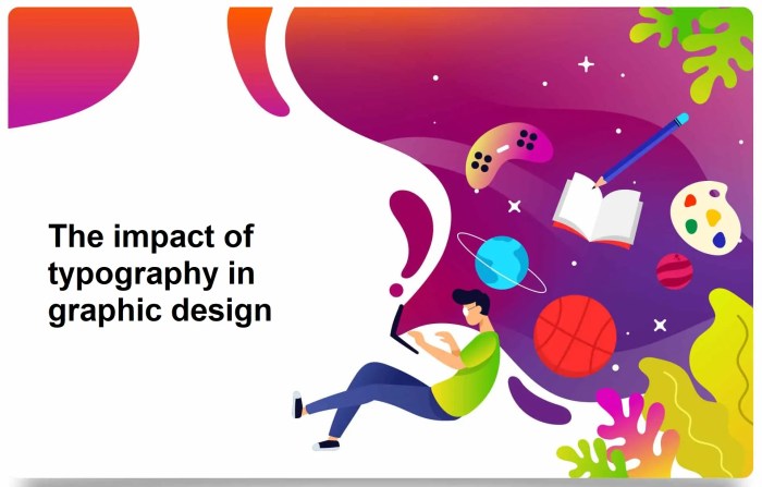
How typography affects conversions is a crucial element of website design. Different fonts, sizes, and styles can significantly impact user perception and ultimately, conversion rates. This exploration delves into the fascinating interplay between typography and user behavior, revealing how carefully chosen fonts can evoke specific emotions and drive conversions.
From the subtle influence of font weight on user engagement to the role of typography in establishing brand identity, this discussion examines the intricate connection between visual design and business outcomes. We’ll also explore how typography guides users through website navigation, ensuring a seamless and effective experience.
Impact of Font Choice on User Perception
Choosing the right font is more than just aesthetics; it significantly influences how users perceive your brand and interact with your content. A well-chosen typeface can build trust, communicate professionalism, and even evoke specific emotions, ultimately impacting conversion rates. Conversely, a poorly selected font can undermine your message and leave a negative impression. This section delves into the profound impact font choice has on user perception, exploring various font families, weights, sizes, and pairings.Font selection is a crucial aspect of user experience design.
Different fonts evoke distinct emotions and perceptions, influencing user engagement and ultimately, conversions. The deliberate choice of a typeface can convey professionalism, playfulness, trustworthiness, or even a sense of urgency, all factors that impact a user’s decision-making process.
Font Families and Their Emotional Impact
Different font families evoke distinct emotional responses. Serif fonts, with their small decorative strokes, often convey a sense of tradition, formality, and sophistication. Sans-serif fonts, clean and simple, project modernity, clarity, and accessibility. Display fonts, often used for headlines or logos, are more dramatic and attention-grabbing, capable of conveying excitement, uniqueness, and a strong visual statement.
Ever wondered why some websites convert better than others? Typography plays a huge role! A well-considered font choice can significantly impact user experience and ultimately, conversions. To truly understand how your brand’s typography is performing, conducting a brand audit is crucial. Conducting a brand audit will help you identify areas where your typography might be hindering conversions.
From font size to spacing, every element contributes to the overall impression, and ultimately affects your bottom line.
Font Weight and User Engagement
Font weight, from thin to bold, significantly impacts user engagement. Bold fonts command attention, suitable for headlines and important calls to action. Light fonts, conversely, can create a sense of elegance and sophistication, appropriate for body text where readability is paramount. Italic fonts often lend a touch of artistry and intrigue, potentially suited for emphasis or quotations.
The judicious use of font weight enhances readability and reinforces the desired message.
Font Size and Line Height
Readability is directly correlated with font size and line height. Appropriate font sizes ensure that the text is easily legible, minimizing eye strain and improving user experience. Larger fonts are better for headlines, while smaller fonts can be used for body text, maintaining a balance. Sufficient line height improves readability by providing adequate spacing between lines, reducing the strain on the eyes.
The proper combination of font size and line height enhances the overall user experience, encouraging prolonged engagement with the content.
Font Pairings and Brand Identity
A well-chosen font pairing can solidify a cohesive brand identity. Fonts should complement each other, creating a unified visual language that reflects the brand’s personality and values. Pairing a strong, bold headline font with a clean, legible body font creates a balance, enhancing readability and conveying a professional image. Matching the font pairings to the brand’s tone and message is crucial for building a strong brand identity and fostering positive user perception.
Table: Font Families, Perceptions, and Use Cases
| Font Family | Perceived Characteristics | Suitable Use Cases | Emotional Response |
|---|---|---|---|
| Serif (e.g., Times New Roman) | Formal, traditional, sophisticated | Formal documents, publications, luxury brands | Trust, reliability, authority |
| Sans-serif (e.g., Arial) | Modern, clean, accessible | Websites, corporate communications, general use | Clarity, professionalism, efficiency |
| Display (e.g., Playfair Display) | Unique, eye-catching, dramatic | Headlines, logos, branding elements | Excitement, uniqueness, boldness |
Typography and Readability
Typography isn’t just about making text look pretty; it’s a crucial element in enhancing user experience and driving conversions. Clear, legible typography significantly impacts how easily users absorb information on a website or app. A well-designed font choice, combined with thoughtful spacing and contrast, can improve comprehension and reduce user frustration, ultimately leading to higher engagement and conversions.Effective typography plays a critical role in guiding users through content and making the experience enjoyable.
A visually appealing and easily readable design is essential to capture attention and encourage users to stay engaged with the material.
Font Size and Line Spacing
Font size is a primary factor in readability. Too small a font can lead to eye strain and fatigue, while overly large fonts can overwhelm the layout. An ideal font size balances legibility with visual appeal. Line spacing, or leading, is the space between lines of text. Appropriate leading ensures that the text is comfortable to read, preventing the lines from appearing crowded or too sparse.
This spacing is critical for maintaining a smooth reading experience, especially for longer paragraphs. Choosing the right font size and line spacing is crucial to accommodate various user needs and preferences.
Letter Spacing and Kerning
Letter spacing, or tracking, is the space between individual letters within a word. Adjusting letter spacing can subtly impact the overall aesthetic and readability. Similarly, kerning is the adjustment of space between specific letter pairs to improve visual appeal and readability. Optimal letter spacing and kerning contribute to the text’s overall aesthetic quality and enhance legibility. Overly tight letter spacing can make the text appear cramped and difficult to read, while excessive spacing can diminish the visual unity of the text.
Contrast and Backgrounds
Contrast between the text and the background is paramount for readability. Sufficient contrast ensures that the text is easily distinguishable against the background. Using a high contrast ratio makes it easier for users to absorb the content without visual strain. This is particularly crucial for users with visual impairments or those viewing the content on devices with varying screen brightness levels.
A lack of contrast can significantly hinder readability and create a negative user experience.
Screen Size Optimization
Optimizing typography for various screen sizes and devices is essential. Adapting font sizes and line spacing for different resolutions ensures that the text remains legible on desktops, tablets, and mobile devices. Responsive typography adjusts automatically to the screen size, ensuring a consistent user experience across different platforms. Poorly optimized typography can lead to a poor user experience on different devices, making it harder to read and navigate.
Effective and Ineffective Typography Choices
Effective typography choices enhance readability and create a positive user experience. For example, using a clear, sans-serif font with sufficient leading and adequate contrast is often an effective choice. Conversely, using a small, dense font with a low contrast ratio is a poor choice. This significantly impacts the readability of the content, potentially leading to frustration and lower engagement.
Typography Styles Comparison
| Typography Style | Readability Score (1-5, 5 being best) | Recommended Use Cases | Example |
|---|---|---|---|
| Serif fonts (e.g., Times New Roman) | 4 | Formal documents, long-form content | A serif font, with its characteristic strokes, can be elegant and readable in print, but may not be ideal for web pages where large blocks of text are often required. |
| Sans-serif fonts (e.g., Arial) | 4.5 | Web pages, headings, body text | A sans-serif font is often a good choice for web pages, as it can be both clear and aesthetically pleasing on screen. |
| Monospace fonts (e.g., Courier New) | 3 | Code blocks, specific technical content | A monospace font is often used to display code, maintaining the same spacing for each character. |
| Display fonts (e.g., Comic Sans) | 2 | Limited use, special emphasis | A display font should be used cautiously and sparingly, as it can distract from the main content. |
Typography and Brand Identity
Typography isn’t just about making text legible; it’s a powerful tool for shaping brand identity. A well-chosen typeface can evoke specific emotions, communicate brand values, and leave a lasting impression on the audience. The careful selection of fonts reflects a brand’s personality and resonates with target customers, ultimately contributing to brand recognition and memorability. Choosing the right typography is crucial for building a cohesive and impactful brand experience.Effective typography significantly impacts a brand’s perception.
Fonts, like colors and logos, contribute to the overall visual language of a brand, creating a recognizable and consistent aesthetic across all platforms. This consistency fosters trust and familiarity, making the brand more memorable and ultimately more effective in driving conversions. A thoughtfully chosen font can instantly convey a brand’s personality, whether it’s playful, sophisticated, or rugged.
Font Choices Reflect Brand Personality and Values
Font choices are critical in communicating a brand’s personality and values. A playful, modern typeface might be appropriate for a tech startup, while a classic serif font could be better suited for a luxury brand. The typeface chosen subtly influences the way consumers perceive the brand. For example, a bold, sans-serif font might convey strength and confidence, while a delicate, script typeface might suggest elegance and sophistication.
Typography plays a huge role in website conversions. Clear, legible fonts and thoughtful spacing directly impact how users interact with your content. Understanding how users engage with your social media content, like Facebook likes, can provide valuable insights. A data-driven approach, like the one explored in facebook likes data driven answer , helps determine the effectiveness of your typography choices on engagement.
Ultimately, optimizing your typography, based on user behaviour data, leads to a better user experience and higher conversion rates.
These visual cues, when paired with other brand elements, create a cohesive and memorable brand identity.
Examples of Brand Typography
Different brands use typography in distinct ways to communicate their unique identity. Consider these examples:
- Coca-Cola utilizes a classic, rounded script font that evokes nostalgia and a sense of community. This font choice is highly recognizable and instantly connects consumers with the brand’s heritage.
- Google employs a clean, modern sans-serif typeface. This choice reflects the brand’s focus on simplicity, innovation, and technology.
- Netflix uses a contemporary, slightly bold sans-serif font, conveying a sense of modernism and innovation, while also being easily readable on various screens.
These examples highlight how specific fonts are chosen to resonate with the target audience and reflect the brand’s personality. This alignment between typography and brand personality is crucial for effective brand communication.
Effectiveness of Typography Styles in Brand Recognition
The effectiveness of various typography styles in establishing brand recognition varies significantly. A well-chosen font that aligns with the brand’s personality and target audience can lead to strong brand recognition. A font that feels out of place or doesn’t convey the intended message can diminish brand impact. For example, a bold, modern font might not be the best choice for a brand focused on traditional values.
- Serif fonts are often associated with tradition, formality, and trustworthiness. They can convey a sense of elegance and sophistication.
- Sans-serif fonts, on the other hand, are generally perceived as modern, clean, and minimalist. They can be more versatile and work well for a wide range of brands.
- Script fonts can communicate a sense of elegance, warmth, and intimacy. They can also convey a personal touch, but should be used with care to avoid looking overly fussy.
Consideration of the specific context and target audience is essential for effective font selection.
Typography and Brand Messaging
Typography can be used to reinforce brand messaging. By pairing the right typeface with the right message, brands can create a powerful and consistent brand identity. A bold, assertive font can highlight key brand messages and call to action. Conversely, a delicate, elegant font can enhance the emotional resonance of a message. The specific font choice reinforces and complements the overall brand communication strategy.
Table: Brand Typography and Effectiveness
| Brand | Typography | Brand Personality | Effectiveness |
|---|---|---|---|
| Apple | San Francisco | Innovative, sleek, minimalist | High; instantly recognizable, consistent with brand image |
| Nike | Various, but often bold sans-serif | Athletic, empowering, performance-driven | High; conveys strength and dynamism |
| Starbucks | Custom typeface | Warm, inviting, community-focused | High; evokes comfort and familiarity |
| Target | Modern sans-serif | Accessible, trendy, affordable | Moderate; recognizable, but not as instantly iconic as some others |
Typography and Call-to-Action (CTA) Effectiveness
The right typography can significantly impact the effectiveness of call-to-action (CTA) buttons on websites and other digital platforms. A well-chosen font, size, weight, and color can increase click-through rates and ultimately boost conversions. Conversely, poor typography can lead to missed opportunities and lost revenue. Understanding the interplay between typography and CTAs is crucial for maximizing their impact.
Font Choices and User Decisions
Font choices can subtly influence user decisions regarding CTAs. A bold, sans-serif font might convey a sense of urgency and encourage immediate action, while a more elegant, serif font might project trust and sophistication. Users often subconsciously associate certain fonts with specific brands and messages, and this association can significantly impact their willingness to click a CTA. For instance, a playful font might be suitable for a children’s website, while a professional font is more appropriate for a financial institution.
Careful consideration of font choices is essential for establishing the desired tone and influencing user behavior.
Typography Styles and Click-Through Rates
Specific typography styles can significantly impact click-through rates. A bold, larger font size with high contrast against the background can increase the prominence of the CTA button and draw more attention to it. This increased visibility often translates into higher click-through rates. Conversely, a small, subtle font, or one that blends with the surrounding text, can easily be overlooked.
A button’s typography should stand out from the rest of the page elements. Consider the overall design aesthetic and ensure the CTA button’s typography enhances, rather than detracts from, the user experience.
CTA Button Styles and Conversion Rates
Different CTA button styles, each with its associated typography, can produce varying conversion rates. For example, a button with a rounded rectangle shape might feel more approachable than a sharp, angular button. The font weight, size, and color choice play a crucial role in influencing these perceptions. A simple button with a prominent call-to-action like “Shop Now!” in a large, bold font will often be more effective than a more elaborate, decorative button with a less clear call to action.
Color and Contrast in Highlighting CTAs
Color and contrast are crucial elements in highlighting CTAs. A contrasting color between the button and the background will make the button more noticeable and increase the likelihood of users seeing and interacting with it. The color should complement the overall brand identity and create a visual hierarchy that guides users through the content. A contrasting color scheme ensures that the CTA button is easily identifiable and stands out against the surrounding elements.
For example, a dark-blue CTA button on a light-gray background provides strong contrast and high visibility.
Font Weight and Size Impact on CTA Effectiveness
Font weight and size play a crucial role in determining CTA effectiveness. A bolder font weight can convey a sense of importance and urgency, while a lighter font weight might project a sense of calmness and approachability. The size of the font should be proportionate to the surrounding text and the overall design to ensure readability and prominence.
The size and weight of the font need to be carefully balanced to be easily readable without being overwhelming.

Choosing the right fonts and sizes can seriously impact how your website converts visitors into customers. A well-designed typography system, for example, can enhance readability and create a visually appealing experience. Understanding the nuances of this design element is crucial, especially when considering successful marketing strategies like those discussed in the HubSpot marketing culture sales guide. hubspot marketing culture sales Ultimately, the right typography can boost your conversion rates, making it an integral part of any effective marketing campaign.
Table of CTA Styles and Conversion Rates
| CTA Style | Typography Choices | Observed Conversion Rates | Influencing Factors |
|---|---|---|---|
| Rounded Rectangle Button | Bold, sans-serif font, large size | 15-20% | Increased visibility, approachable design |
| Sharp Rectangle Button | Bold, sans-serif font, medium size | 12-15% | Clear call to action, straightforward design |
| Artikeld Button | Thin, serif font, medium size, contrasting color | 10-12% | Visual interest, subtle prominence |
| Image Button | Small, bold font, complementary to image | 18-22% | Visual appeal, clear call to action |
Typography and Website Navigation
Typography isn’t just about aesthetics; it plays a crucial role in guiding users through a website. Effective typography choices can significantly enhance the user experience by making navigation intuitive and information easily digestible. A well-structured typographic hierarchy helps users quickly scan and understand the website’s layout, leading to increased engagement and ultimately, higher conversion rates.Clear and consistent typography contributes significantly to the overall feel and usability of a website.
By carefully considering font choices, sizes, and weights, designers can create a seamless user journey that encourages exploration and interaction. This is particularly important for complex websites or those with a vast amount of information, as clear visual cues make the difference between frustration and satisfaction.
How Typography Guides User Navigation
Typography, when strategically employed, can function as a silent guide, directing users to various sections of a website. Font variations in size, weight, and style can clearly distinguish different levels of hierarchy within the website’s structure. This clear visual hierarchy allows users to quickly scan and understand the website’s layout, allowing them to effortlessly navigate to the information they need.
Distinguishing Website Sections with Typography
Different sections of a website can be distinguished using typography. For instance, headings can be formatted with bolder fonts and larger sizes to indicate primary sections. Subheadings can utilize a slightly smaller, yet still prominent font, to delineate subsections. This hierarchy clearly signals the relationship between different pieces of information. This is particularly important for large websites or e-commerce sites, where a user needs to be able to quickly scan the site and find what they need.
Effective Use of Typography for Navigation: Examples
Numerous websites successfully employ typography to enhance navigation. For example, sites like Amazon use a strong hierarchy of headings and subheadings, making it easy to browse through products and categories. Similarly, Google utilizes a clear hierarchy to guide users through their search results and services, enabling a smooth and intuitive experience. These websites highlight the importance of a consistent and well-defined typographic system for creating a user-friendly website experience.
Creating Clear Visual Hierarchies
Creating a clear visual hierarchy is essential for effective website navigation. Headings, subheadings, and body text should have distinct sizes, weights, and styles to emphasize the different levels of importance. For instance, primary headings might be displayed in a bold, sans-serif font with a larger size, while secondary headings use a slightly smaller, italicized version. Using these different typographic styles, you can establish a clear structure for the site.
Emphasis Through Typography
Typography can be used to emphasize important information, such as call-to-action (CTA) buttons or key features. By using a contrasting font weight, color, or size, designers can draw attention to critical elements, encouraging user engagement and conversions. For instance, using a bold, bright color for a call-to-action button helps to distinguish it from the surrounding text and makes it more likely to be noticed.
Enhancing Website Navigation with Typography
- Using different font sizes and weights to create a clear visual hierarchy.
- Employing contrasting colors to highlight key elements, such as navigation links or call-to-action buttons.
- Utilizing varying font styles (e.g., sans-serif, serif) to distinguish different sections or levels of importance.
- Ensuring consistency in typography throughout the website to maintain a cohesive and professional aesthetic.
- Applying appropriate font sizes for readability on different screen sizes.
- Creating a clear visual distinction between headings, subheadings, and body text to aid in navigation.
These typography choices can significantly enhance ease of use and user experience, resulting in a more intuitive and enjoyable browsing experience. By paying attention to these details, designers can contribute to a more effective and user-friendly website.
Accessibility Considerations in Typography
Typography isn’t just about aesthetics; it’s about creating a user experience that’s inclusive for everyone. This means considering the needs of users with disabilities, ensuring that your font choices and overall design are accessible to a wider audience. Ignoring accessibility considerations can lead to a significant portion of potential users being excluded, which translates to lost revenue and a diminished brand reputation.Ensuring inclusive typography goes beyond just choosing a readable font; it’s about understanding the diverse ways people interact with and perceive information.
By prioritizing accessibility, businesses demonstrate a commitment to inclusivity and build trust with their target audience.
Importance of Accessible Typography for Users with Disabilities
Accessible typography is crucial for users with visual impairments, learning disabilities, or motor impairments. It allows everyone to effectively access and engage with the content on your website or application. A well-designed, accessible interface fosters an inclusive environment where all users can easily read and understand the information presented.
Ensuring Inclusive Font Choices for Visual Impairments
Choosing fonts with clear shapes and sufficient spacing is vital for users with visual impairments. Avoid overly decorative or condensed fonts that can make reading difficult. Fonts with a high x-height (the distance between the baseline and the top of lowercase letters) are generally more readable, allowing for easier differentiation between characters. Consider using sans-serif fonts for their clarity and simplicity.
Examples of Accessible Typography Practices
Several practices contribute to accessible typography. Using a sufficient font size (at least 16px) is essential for readability. Providing ample line spacing (leading) prevents text from appearing cramped and reduces eye strain. Employing clear, distinct character spacing (tracking) is also crucial for separating characters and improving readability.
Importance of Appropriate Color Contrast
Color contrast is a key element in ensuring readability for users with visual impairments. The WCAG (Web Content Accessibility Guidelines) provides specific guidelines for color contrast ratios, ensuring sufficient differences in luminance between text and background colors. Tools are available to assess color contrast, ensuring compliance with accessibility standards and a positive user experience.
Elaboration on the Use of Alt Text for Visual Elements
Alt text, or alternative text, is crucial for conveying information about images and other visual elements to users who cannot see them. When an image is used, a description should be provided in the alt text, offering a clear and concise summary of the image’s content. This aids users with visual impairments, screen readers, and those who might have images disabled or turned off.
Alt text also improves .
Typography Choices for Aesthetics and Accessibility, How typography affects conversions
This table provides examples of typography choices that balance aesthetic appeal with accessibility.
| Font Family | Font Size (px) | Line Height (px) | Color Contrast Ratio |
|---|---|---|---|
| Open Sans | 16 | 24 | 4.5:1 (or higher) |
| Roboto | 18 | 28 | 7:1 (or higher) |
| Arial | 14 | 20 | 3:1 (or higher) |
| Lora | 16 | 24 | 4.5:1 (or higher) |
These examples highlight the importance of considering font size, line height, and color contrast in creating a truly accessible and engaging user experience. Aesthetics should not come at the expense of accessibility. Remember to always prioritize inclusivity and compliance with accessibility standards.
Ultimate Conclusion: How Typography Affects Conversions
In conclusion, understanding how typography affects conversions is essential for any business aiming to maximize its online presence. By carefully considering font choices, readability, and brand identity, website owners can create a powerful visual experience that resonates with users and ultimately drives conversions. The impact of well-crafted typography is undeniable, and this analysis offers a practical guide for achieving success.