Data visualization in B2B website strategies is crucial for driving engagement and conversions. This approach transforms complex data into compelling visuals, enhancing user experience and providing actionable insights. From boosting lead generation to facilitating informed decision-making, effective data visualization can be a game-changer for B2B businesses.
This exploration dives deep into the multifaceted world of data visualization, covering everything from the fundamentals of incorporating data visualizations into your website to the latest trends and technologies. We’ll examine how different types of charts, graphs, and interactive elements can be used to achieve specific goals, like attracting qualified leads or enhancing user engagement. Plus, we’ll explore the technical aspects, including data security and scalability, along with successful case studies from various industries.
Introduction to Data Visualization in B2B Websites
Data visualization is no longer a luxury but a necessity for B2B websites aiming to engage visitors and drive conversions. Presenting complex data in an easily digestible format through charts, graphs, and interactive elements significantly enhances the user experience. This approach fosters trust and understanding, allowing potential clients to quickly grasp key information about products, services, or company performance.By transforming raw data into compelling visuals, B2B websites can showcase their expertise, highlight success stories, and present a more dynamic and professional image.
This ultimately translates into increased engagement, higher conversion rates, and a stronger brand presence.
Importance of Data Visualization in Enhancing User Experience
Data visualization transforms complex data sets into easily understandable visual representations. This approach simplifies intricate information, making it accessible and engaging for a wider audience. Users can quickly grasp key insights and patterns, leading to a more efficient and enjoyable experience.
Examples of Data Visualization Improving Engagement
Visual representations of sales figures, market trends, customer demographics, and success stories can significantly boost user engagement. For instance, a chart showcasing a company’s consistent revenue growth over several years can instill confidence in potential investors. Similarly, a map highlighting customer distribution across various regions can demonstrate a company’s market reach and global presence. Furthermore, interactive dashboards allow users to explore data in depth, tailoring their experience to their specific needs and interests.
Best Practices for Incorporating Data Visualization Elements
Effective data visualization requires careful consideration of design principles. Firstly, ensure visuals are clear, concise, and easy to understand. Avoid overwhelming users with excessive data or complex visualizations. Secondly, maintain consistency in design and style across the entire website. Lastly, align visuals with the overall brand identity and tone.
Different Types of Data Visualization Suitable for B2B Websites
Several types of data visualization are particularly effective for B2B websites. These include bar charts for comparing metrics, line graphs for illustrating trends, pie charts for representing proportions, and scatter plots for identifying correlations. Furthermore, maps are useful for showcasing geographical data, and interactive dashboards provide a dynamic and user-friendly way to explore detailed information.
Comparison of Data Visualization Techniques
| Visualization Technique | Description | Suitable for | Strengths | Weaknesses |
|---|---|---|---|---|
| Bar Charts | Compare values across categories. | Comparing sales figures, market share, or product performance. | Easy to understand, visually appealing. | Less effective for showing trends over time. |
| Line Graphs | Illustrate trends over time. | Showing growth patterns, project forecasts, or performance metrics. | Excellent for visualizing trends, easy to track changes. | Can become cluttered if too many data points are included. |
| Pie Charts | Represent proportions of a whole. | Displaying market share, product mix, or budget allocation. | Visually intuitive, clear representation of proportions. | Less effective for showing trends, difficult for large datasets. |
| Scatter Plots | Show relationships between two variables. | Identifying correlations between variables like customer acquisition cost and lifetime value. | Effective for identifying patterns and correlations. | Difficult to interpret with a large number of data points. |
| Maps | Show geographical data. | Representing customer distribution, sales by region, or service area. | Provides a clear understanding of spatial relationships. | Limited to geographical data. |
Data Visualization for Lead Generation: Data Visualization In B2b Website Strategies

Attracting and converting leads is a cornerstone of B2B success. Data visualization plays a crucial role in this process by transforming complex data into easily digestible insights. By presenting information visually, B2B websites can effectively communicate value propositions, highlight customer pain points, and showcase solutions, ultimately driving more qualified leads. This approach allows businesses to connect with potential customers on a more intuitive level, fostering trust and understanding.Data visualization, when strategically implemented on a B2B website, can significantly enhance the lead generation process.
It provides a clear and compelling narrative around your offerings, guiding potential clients through the sales funnel and fostering engagement. The right visuals can showcase the benefits of your product or service in a way that traditional text-heavy content cannot.
Key Metrics for Lead Attraction
Understanding which metrics to visualize is paramount for attracting qualified B2B leads. Focus on metrics directly tied to your target audience’s needs and pain points. This could include website traffic sources, time spent on specific pages, conversion rates from different marketing channels, and the most common questions asked on your contact forms. Visualizing these metrics allows for a deeper understanding of how potential customers interact with your website, revealing valuable insights for targeted campaigns.
Highlighting Customer Insights for Lead Qualification
Data visualization can effectively highlight customer insights, enabling more precise lead qualification. By visually representing data points such as demographics, industry, company size, and engagement history, you can quickly identify potential high-value leads. For example, a bar chart showcasing the number of leads from specific industries can reveal opportunities for targeted marketing campaigns. A scatter plot illustrating the correlation between engagement time and conversion rates can help you understand which leads are most likely to convert.
Visualizing Customer Journey Stages
Visualizing customer journey stages provides a clear picture of where potential leads are in their decision-making process. A flow chart or a series of interconnected diagrams can effectively depict the different stages, from initial awareness to final purchase. By identifying potential bottlenecks or friction points, you can tailor your messaging and offerings to better meet the needs of customers at each stage.
For example, a funnel chart illustrating the conversion rate at each stage of the buying cycle helps identify areas for improvement in the lead nurturing process.
Correlation Between Data Visualizations and Lead Generation Outcomes
| Data Visualization Type | Lead Generation Outcome | Description |
|---|---|---|
| Funnel Chart | Improved Conversion Rates | Visualizes the conversion rate at each stage of the customer journey, highlighting areas for improvement. |
| Bar Chart | Targeted Marketing Campaigns | Displays the number of leads from specific industries or demographics, enabling targeted marketing efforts. |
| Line Chart | Trend Analysis | Illustrates the growth or decline of leads over time, providing insights into the effectiveness of marketing campaigns. |
| Scatter Plot | Lead Qualification | Shows the correlation between engagement time and conversion rates, enabling better lead qualification. |
B2B Data Visualization Examples by Industry
| Industry Vertical | Example Data Visualization | Description |
|---|---|---|
| Software as a Service (SaaS) | Heatmap of user engagement on different features | Highlighting the most used features of the software can guide product development and marketing efforts. |
| Financial Services | Comparison of investment portfolios over time | Visualizing investment performance can demonstrate value propositions to potential clients. |
| Manufacturing | Production efficiency charts | Visualizing production data can highlight areas for optimization and increased profitability. |
| Healthcare | Patient satisfaction ratings over time | Visualizing patient satisfaction trends can guide improvements in patient care. |
Enhancing User Engagement with Data Visualization
Data visualization is no longer a mere embellishment on a B2B website; it’s a crucial tool for driving user engagement and fostering deeper connections with potential clients. Effective visualizations can transform complex data into easily digestible insights, guiding users through your offerings and ultimately converting them into leads. This section explores how to leverage data visualization to enhance website navigation and information discovery, leading to increased user interaction and a more impactful online presence.Interactive visualizations, strategically integrated into the website’s design, can significantly improve user engagement.
By allowing users to explore data dynamically, you create a more interactive and personalized experience. This active involvement can foster a stronger sense of connection and encourage deeper exploration of your offerings.
Improving Website Navigation and Information Discovery
Data visualization can dramatically improve website navigation and information discovery. Users can quickly grasp key trends and patterns, leading to quicker comprehension of the website’s content. Well-designed visualizations serve as a navigational aid, directing users to pertinent information with minimal effort. Visual cues make it easier to locate specific data points, fostering a more intuitive user experience.
A visually appealing and easily navigable website often translates to higher engagement and conversion rates.
Examples of Interactive Data Visualizations
Interactive charts, graphs, and maps are powerful tools for enhancing user engagement. A heatmap displaying sales performance by region, for instance, allows users to quickly identify high-performing areas and understand potential opportunities. Similarly, an interactive timeline visualizing the company’s history allows users to explore key milestones and understand the company’s evolution. These interactive elements transform static data into dynamic experiences, prompting deeper exploration and engagement.
Integrating Data Visualization into Website Design
Effective integration of data visualizations into the website’s design is critical for maximizing their impact. The visualizations should seamlessly blend with the overall aesthetic, reinforcing the brand’s identity. Consistent color schemes and stylistic choices create a cohesive and professional presentation. The visual hierarchy of the website should be considered, placing the visualizations strategically to guide user attention and ensure clarity.
This ensures the visualizations complement, not detract from, the website’s overall design.
Static vs. Interactive Data Visualizations
Static data visualizations, while effective for presenting basic information, often lack the dynamic appeal of interactive visualizations. Interactive visualizations provide users with the ability to explore data, enabling deeper understanding and engagement. For example, a static bar graph showing sales figures might not allow users to drill down into specific regional performance, whereas an interactive version can. The choice between static and interactive depends on the specific data and the desired user experience.
Incorporating User Feedback into Data Visualization Design
Gathering and incorporating user feedback is essential for optimizing data visualizations. User testing can identify areas where the visualizations are confusing or ineffective. Gathering feedback on visual clarity, data accessibility, and overall engagement allows for continuous improvement. Surveys, feedback forms, and direct user interaction can provide valuable insights into how users perceive and interact with the visualizations.
This iterative process ensures that the visualizations effectively meet the needs and expectations of your target audience.
Data Visualization for Decision Making
Data visualization is crucial for B2B website strategies, not just for attracting leads and enhancing engagement, but also for facilitating informed decision-making. By transforming complex data into easily digestible visuals, businesses can gain valuable insights into website performance, user behavior, and key performance indicators (KPIs), ultimately leading to more effective strategies and improved ROI. This process allows for quicker identification of trends and patterns, enabling proactive adjustments and strategic planning.Data visualization empowers businesses to understand the “why” behind the numbers.
Data visualization is key for B2B website strategies, helping businesses showcase complex information in a digestible format. However, with the recent court filing challenging Mullenweg’s grip on WordPress, this legal battle could potentially impact website development and, in turn, the visual strategies used for B2B sites. Ultimately, clear and compelling data visualizations remain crucial for connecting with and converting potential clients on any business site.
Instead of simply looking at raw data, businesses can interpret patterns, identify areas for improvement, and proactively adjust strategies. This is particularly valuable for B2B websites, where understanding the needs and behaviors of potential clients is paramount for success.
Supporting Informed Business Decisions, Data visualization in b2b website strategies
Data visualization provides a clear and concise picture of website performance, allowing stakeholders to quickly grasp key metrics and trends. This facilitates informed decisions, enabling businesses to allocate resources effectively and adapt strategies in response to emerging insights. It fosters a shared understanding of data across teams, promoting collaboration and alignment on strategic goals.
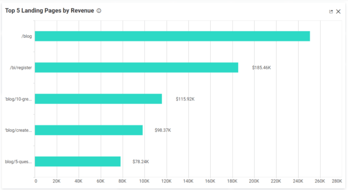
Examples of Data Visualizations for KPIs
Visual representations of key performance indicators (KPIs) are essential for tracking website progress and identifying areas for optimization. For instance, a line graph can illustrate website traffic trends over time, highlighting seasonal fluctuations or significant growth periods. A bar chart can effectively compare conversion rates across different marketing campaigns, pinpointing successful strategies. A scatter plot can reveal correlations between website engagement metrics, such as time spent on pages and bounce rates, assisting in identifying user behavior patterns.
Furthermore, a heatmap can illustrate user interaction with specific website elements, helping to identify areas that need improvement or adjustments in design.
Creating Reports and Dashboards with Data Visualization
Data visualizations are fundamental components of reports and dashboards. They transform raw data into actionable insights, presenting key metrics in a visually engaging and understandable format. Reports and dashboards should include relevant visualizations to highlight trends, anomalies, and overall performance. For example, a dashboard could display website traffic, conversion rates, bounce rates, and other crucial KPIs in real-time.
The visual representation of these metrics allows for a comprehensive overview of website performance, facilitating quick identification of problems or opportunities.
Data visualization is crucial for B2B website strategies, making complex information digestible for potential clients. Understanding how to optimize your website’s structure and content, like focusing on on-page vs off-page SEO, on page vs off page seo , is vital. Ultimately, clear and compelling visuals, combined with a strong online presence, will drive engagement and ultimately, lead generation.
Steps to Create Data Visualizations for Strategic Planning
Creating data visualizations for strategic planning involves several crucial steps. First, identify the key performance indicators (KPIs) relevant to the strategic goals. Second, collect and clean the data associated with those KPIs. Third, choose appropriate visualization types that effectively represent the data and highlight the desired insights. Fourth, create visually appealing and informative visualizations that are easy to understand.
Finally, integrate the visualizations into reports and dashboards for ongoing monitoring and analysis. By following these steps, businesses can effectively use data visualization to support strategic planning and decision-making.
Assessing B2B Website Performance Using Data Visualization
| Data Visualization Type | How to Assess B2B Website Performance |
|---|---|
| Line Graph | Track website traffic trends over time, identify seasonal patterns, and measure overall growth. |
| Bar Chart | Compare conversion rates across different marketing campaigns or channels, highlighting successful strategies and areas for improvement. |
| Scatter Plot | Identify correlations between website engagement metrics, such as time spent on pages and bounce rates, and user behavior patterns. |
| Heatmap | Visualize user interaction with specific website elements, such as buttons or forms, pinpointing areas that require design adjustments. |
| Pie Chart | Represent the distribution of website traffic sources, such as organic search, social media, or paid advertising. |
Technical Considerations for Data Visualization on B2B Websites
Data visualization, when implemented effectively on B2B websites, can significantly enhance user engagement and drive crucial business outcomes. However, successful integration requires careful consideration of technical aspects, ranging from the choice of tools to the seamless integration with existing systems. This section delves into the key technical hurdles and solutions to ensure your data visualizations are not only informative but also robust and scalable.The technical underpinnings of data visualization on B2B websites go beyond simply presenting data.
Proper implementation ensures the visualization accurately reflects the data, loads quickly, adapts to diverse user needs, and integrates seamlessly with the website’s existing infrastructure. Furthermore, robust security measures are crucial to protect sensitive business information.
Appropriate Data Visualization Tools
Selecting the right data visualization tools is critical. Tools should align with the website’s existing architecture, data structure, and the complexity of the visualizations needed. A few popular and powerful choices include Tableau, Power BI, and D3.js. Tableau excels in creating interactive dashboards and reports, while Power BI is often favored for its integration with Microsoft ecosystem tools.
D3.js, a JavaScript library, offers maximum customization for complex visualizations and integration into existing web applications. Consider the size of your team, the type of data you are working with, and the desired level of interactivity when choosing the best tool.
Technical Aspects of Integration
Integrating data visualization into website architecture requires careful planning and execution. This includes ensuring compatibility with the website’s backend systems (databases, servers) and front-end frameworks (HTML, CSS, JavaScript). This process often involves APIs (Application Programming Interfaces) to pull data from your database and format it for display. The API is the crucial link between the data source and the visualization tools.
Data visualization is key to B2B website success, helping you showcase complex info clearly. To ensure your website is discoverable by potential clients, make sure to add your site to Bing Webmaster Tools, how to add your website to bing webmaster tools. This will help search engines like Bing crawl and index your data-rich content, ultimately boosting your visibility and driving more qualified leads.
Effective data visualization strategies, when paired with proper website optimization, will be a powerful combination for your business.
For example, if your website uses a content management system (CMS) like WordPress, integrating a visualization tool requires ensuring the tool’s compatibility with the CMS’s API. Furthermore, the visualization should be responsive to different screen sizes and devices, maintaining clarity and usability across various platforms.
Data Security in B2B Data Visualization
Data security is paramount in B2B data visualization. Visualizations often display sensitive financial or operational data. Implementing robust security protocols is essential to protect this information from unauthorized access or breaches. This involves using secure data transmission methods, encryption, and access controls to limit who can view and interact with the visualizations. For instance, restricting access to specific visualizations based on user roles and permissions can prevent unwanted data exposure.
Employing secure authentication mechanisms, like multi-factor authentication, further strengthens security protocols.
Scalability of Data Visualization Solutions
B2B websites frequently experience fluctuating data volumes. The data visualization solution should be scalable to accommodate future growth. This means the tool should be able to handle larger datasets and increasing user traffic without compromising performance. Cloud-based visualization tools often offer built-in scalability features, enabling effortless adaptation to changing data needs. Furthermore, choosing a scalable database system for storing and retrieving data is vital.
Integration with Website Analytics Platforms
Integrating data visualization with website analytics platforms (like Google Analytics) is critical for tracking user engagement with visualizations. This integration allows for the analysis of user behavior, identifying patterns, and improving visualization design. This integration can involve utilizing APIs to pull data from analytics platforms and displaying key metrics alongside the visualizations. This approach provides valuable insights into how users interact with the data presented, facilitating informed decisions regarding visualization design and data presentation.
Case Studies and Examples of Successful Data Visualization

Data visualization is no longer a nice-to-have but a necessity for B2B websites. Effective visualizations can transform complex data into easily digestible insights, driving engagement, boosting lead generation, and ultimately, fostering better decision-making. Companies that master this technique are seeing impressive results.A successful implementation of data visualization on a B2B website is not just about pretty charts; it’s about strategic use that aligns with specific business goals.
It involves understanding the target audience, the data available, and the key messages to convey. By translating raw data into compelling visuals, companies can communicate value propositions and showcase expertise, thereby strengthening their brand and building trust with potential clients.
Successful Data Visualization Implementations
Companies across various sectors are leveraging data visualization to enhance their websites. This section provides specific examples to demonstrate the power of this approach.
- Software as a Service (SaaS) Companies: A SaaS company specializing in project management software might use interactive dashboards to display key metrics like customer growth, feature adoption rates, and user satisfaction scores. These visualizations allow potential clients to quickly assess the platform’s performance and understand its value proposition. Visual representations of customer success stories can also strengthen the brand and demonstrate the platform’s value in practice.
- Manufacturing Companies: A manufacturing company focusing on industrial automation might use data visualizations to showcase the efficiency gains achieved by their solutions. Graphs displaying reduced downtime, improved output, and minimized waste can effectively communicate the value proposition. Highlighting the ROI and cost savings in easily digestible charts can persuade potential clients to consider the automation solutions. Animated graphs of the process flow can illustrate the complexities of the process and how their technology simplifies it.
- Financial Services Companies: A financial advisory firm can use interactive charts to illustrate investment portfolios’ performance over time, providing potential clients with a clear picture of the firm’s expertise and track record. The interactive element allows users to explore the data and gain a deeper understanding of the underlying trends and potential returns. Clear visualizations of risk tolerance metrics and market trends help clients make informed decisions.
Metrics for Evaluating Effectiveness
Evaluating the success of data visualization implementations is crucial for continuous improvement. Various metrics can be used to gauge the impact of these visualizations on user behavior and business outcomes.
- Website Traffic and Engagement: Tracking website traffic and user engagement metrics like time spent on the site, pages visited, and click-through rates for data-heavy sections provides insights into how users interact with the visualizations. Increased engagement suggests that the visualizations are compelling and effective in conveying information.
- Lead Generation: Analyzing the number of leads generated through the website, particularly from visitors interacting with the visualizations, is essential. A correlation between visualization interaction and lead generation indicates that the visuals are effective in capturing interest and promoting conversions.
- Conversion Rates: Tracking conversion rates, such as the percentage of visitors who complete a desired action (e.g., downloading a whitepaper or requesting a demo), can directly measure the impact of the visualizations on driving conversions.
Challenges in Implementing Data Visualization
Implementing data visualization on B2B websites is not without its challenges. Companies need to consider these aspects when designing and deploying these visualizations.
- Data Quality and Availability: Ensuring the accuracy, completeness, and reliability of the data is crucial. Inaccurate data can lead to misleading visualizations and undermine the trust of potential clients.
- Technical Expertise: Developing and maintaining data visualizations requires technical expertise. Companies might need to invest in skilled personnel or tools to ensure the visualizations are functional and user-friendly.
- User Experience (UX): Visualizations should be designed with the user experience in mind. Complex or overwhelming visualizations can deter users. The design must be intuitive and easy to navigate.
Case Study Summaries
| Company | Website (URL) | Type of Visualization | Metrics Used | Key Results |
|---|---|---|---|---|
| XYZ Corporation | (www.xyzcorp.com) | Interactive dashboards showing sales performance | Lead generation, conversion rates, time spent on site | Significant increase in leads and conversion rates |
| ABC Solutions | (www.abcsolutions.com) | Animated process flow diagrams | Website traffic, bounce rate, pages per visit | Reduced bounce rate and increased time spent on site |
| PQR Technologies | (www.pqrotech.com) | Charts illustrating product features | Conversion rates, product inquiries | Improved product understanding and higher conversion rates |
Future Trends in Data Visualization for B2B Websites
Data visualization is rapidly evolving, and B2B websites are increasingly relying on it to engage users, drive conversions, and enhance decision-making. This evolution is fueled by advancements in technology, changing user expectations, and the ever-increasing volume of data available. Understanding these future trends is crucial for B2B companies seeking to stay competitive and leverage data effectively.The future of data visualization for B2B websites extends beyond static charts and graphs.
It involves interactive dashboards, dynamic visualizations, and personalized experiences tailored to specific user needs. This shift emphasizes a more user-centric approach, moving away from generic displays towards personalized insights that drive deeper engagement and informed decision-making.
Emerging Data Visualization Technologies
The landscape of data visualization tools is constantly shifting. New technologies are emerging that offer greater flexibility, interactivity, and customization options for presenting data in engaging and informative ways. Tools like Tableau, Power BI, and various open-source libraries are constantly being updated with new features, allowing for more sophisticated visualizations and advanced analytics. For instance, interactive maps that allow users to drill down into regional performance data, or heatmaps that illustrate complex relationships between different metrics are becoming increasingly common.
AI and Machine Learning in Data Visualization
Artificial intelligence (AI) and machine learning (ML) are poised to revolutionize data visualization on B2B websites. AI can automatically generate visualizations tailored to the user’s specific needs and interests, providing personalized insights without manual intervention. For example, an AI-powered system could identify key performance indicators (KPIs) relevant to a specific user based on their past interactions and suggest relevant visualizations.
This level of personalization and automation will become crucial in streamlining the decision-making process for B2B users. ML algorithms can also uncover hidden patterns and relationships within the data, allowing for more accurate and insightful visualizations. These algorithms can predict future trends, identify anomalies, and generate actionable recommendations.
Augmented and Virtual Reality for Data Visualization
Augmented reality (AR) and virtual reality (VR) technologies offer immersive and interactive ways to visualize complex data. Imagine a VR experience that allows users to explore a 3D model of their company’s global operations, overlaid with real-time data visualizations showing performance metrics in different regions. AR can be used to overlay data visualizations on top of real-world objects, providing contextual insights.
For instance, an AR app could overlay sales figures on a physical map of a sales territory, providing a dynamic visual representation of performance.
Mobile-First Design and Data Visualization
Mobile-first design is increasingly critical for B2B websites. Data visualizations must be optimized for mobile devices, ensuring clear presentation and seamless user experience across all screen sizes. Responsive visualizations that adapt to different screen resolutions and orientations are essential. Mobile-first design forces a focus on clear, concise, and easily digestible data visualizations. Users can quickly grasp key insights from dashboards or charts, even on smaller screens.
Personalization in Data Visualization for B2B Audiences
Personalization is key to engaging B2B audiences. Data visualizations should be tailored to individual user needs, interests, and roles. For instance, a sales representative might have access to different visualizations than a marketing manager. Dynamically adjusting the displayed data based on user roles, past interactions, and preferences enhances engagement and relevance. By delivering highly personalized visualizations, B2B websites can significantly improve user satisfaction and drive conversions.
Ultimate Conclusion
In conclusion, data visualization is not just a trend; it’s a powerful tool for modern B2B websites. By effectively presenting data, businesses can create more engaging experiences, attract qualified leads, support strategic decision-making, and ultimately, drive growth. The future of data visualization in B2B is bright, with continued innovation in technologies and strategies to further enhance the user experience.
Embrace the power of visual storytelling to connect with your audience and achieve your business objectives.